The Lince Hotels & Resorts is a Portuguese hotel chain with properties located across the country and plans for future expansion. At the time of this rebranding project, the group included The Lince Azores, The Lince Nordeste, and The Lince Santa Clara. Each hotel reflects the brand’s commitment to offering authentic experiences and high-quality hospitality in distinctive locations.
CLIENT COMPANY
The Lince Hotels & Resorts, Portugal
YEAR
2023
SEGMENT
Visual Identity Development, Branding, Brand System, Brandbook
ROLE
Brand Designer
Visual Identity & Brand Guidelines
EXPERTISE
Brand Identity
Color & Typography System
Pattern & Graphic Applications
Brandbook Creation
Brand Consistency
Branding Case Study
IDEATION
Brand Concept / Visual Identity
Color Palette & Typography Selection
Pattern Design & Brand Applications
Brandbook Guidelines
SOFTWARE & PLATFORMS
Adobe Illustrator
Adobe Photoshop
Adobe InDesign
Accessible Brand Colors
PROJECT OVERVIEW
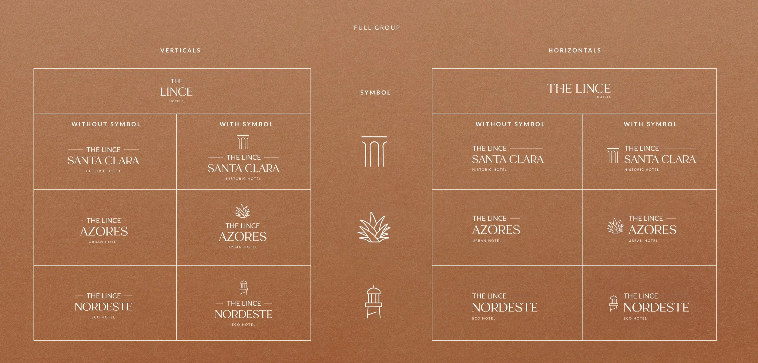
The main focus of this project was to redesign and modernize the logo of The Lince Hotels & Resorts, ensuring it aligned with industry standards and the expectations of its target audience. Beyond updating the visual identity, the rebranding extended to all brand applications across the different hotel units. To secure consistency moving forward, a comprehensive brandbook was developed, covering logo usage, color palette, typography, and visual applications.
CHALLENGE
The key challenge was to refine the brand identity in a way that both elevated its positioning in the competitive hospitality market and maintained coherence across multiple hotel units. The previous logo no longer reflected the brand’s values or competitive landscape, which made it necessary to create a more contemporary and versatile system. The process required balancing the individuality of each hotel with a strong and unified brand presence, resulting in a cohesive identity ready to support the group’s future growth.
STARTING PROCESS
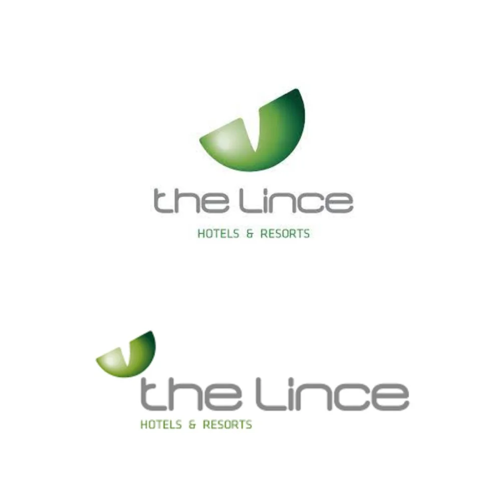
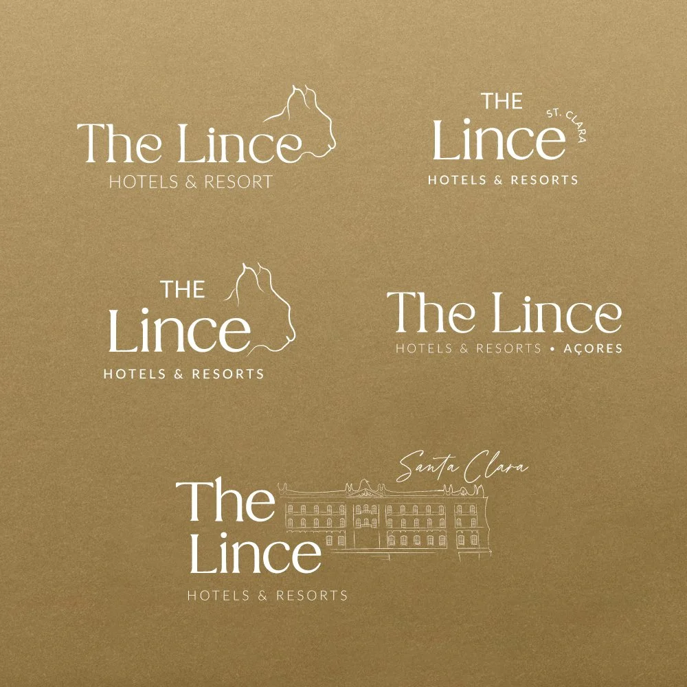
The project began with an analysis of the brand’s pre-2023 logo, which revealed the need for a more contemporary and competitive identity. From this starting point, I developed a series of initial logo sketches to explore possible directions for the rebrand. Among these early concepts, I experimented with a silhouette of a lynx, a literal reference to the group’s name, as well as an illustration of one of its hotels, The Lince Santa Clara in Vila do Conde. These sketches were later presented to the client to evaluate which creative path aligned best with the brand’s vision and long-term positioning.
SANTA CLARA
Historic Hotel at Vila do Conde
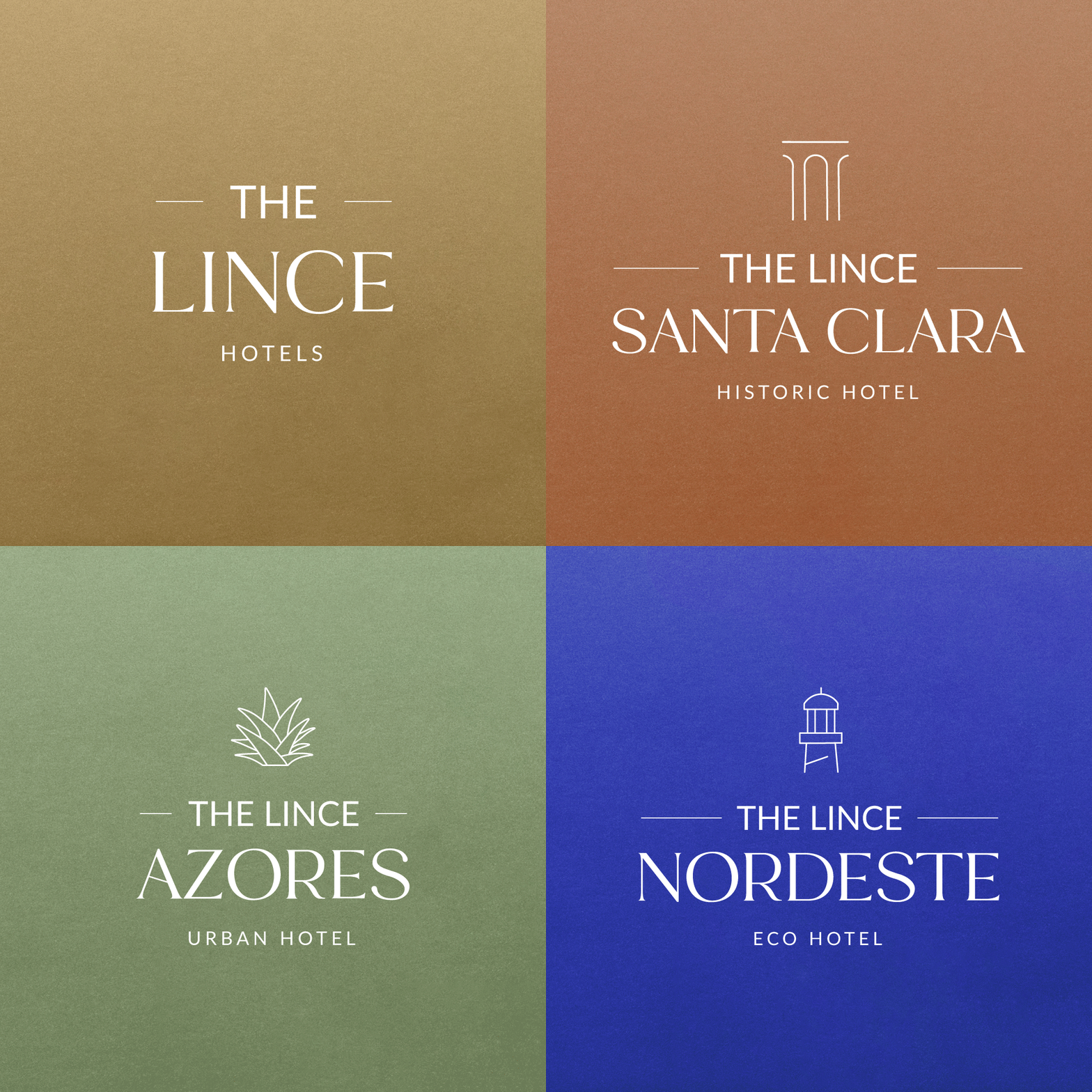
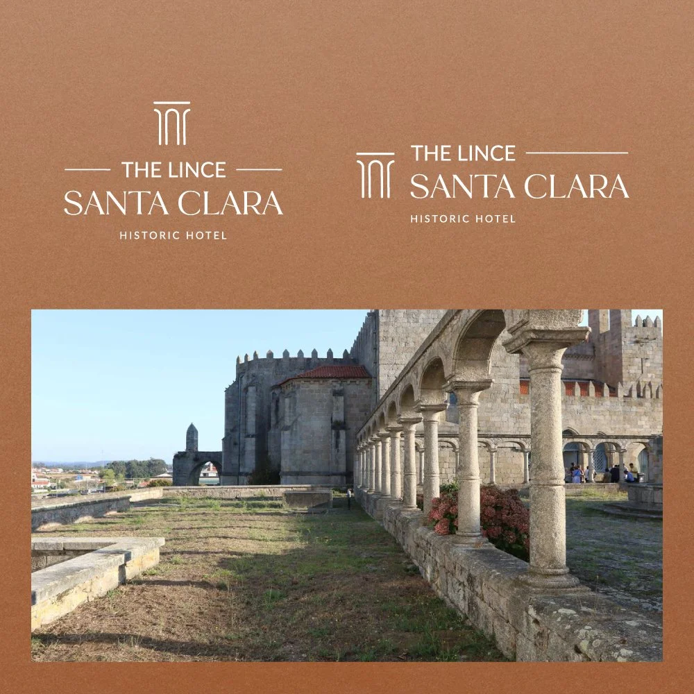
For the rebranding of The Lince Santa Clara, located in Vila do Conde within a historic monastery, the visual identity was carefully developed to reflect the hotel’s heritage and setting. The chosen copper tones evoke the warmth and timelessness of the convent’s architecture, while the logo variations, both horizontal and vertical, ensure flexibility across different applications.
To further anchor the identity to its unique context, a dedicated symbol was designed, inspired by the cloisters of the monastery, reinforcing the connection between the brand and its historical roots. Complementary applications and branded materials were also created to illustrate how the identity could seamlessly integrate into the hotel’s environment.
NORDESTE
Eco Hotel at Nordeste in Azores
For the rebranding of The Lince Nordeste, an eco hotel located in the Azores, the identity was inspired by its unique setting near the Arnel lighthouse. This landmark became the foundation for the hotel’s symbol, visually connecting the brand to its natural surroundings and maritime heritage.
To ensure flexibility and consistency, the logo was developed in both horizontal and vertical versions, allowing seamless adaptation across different applications. Complementary branded materials and product adaptations were also created, reinforcing the hotel’s connection to its location and sustainable positioning within the group.
AZORES
Urban Hotel at São Miguel island
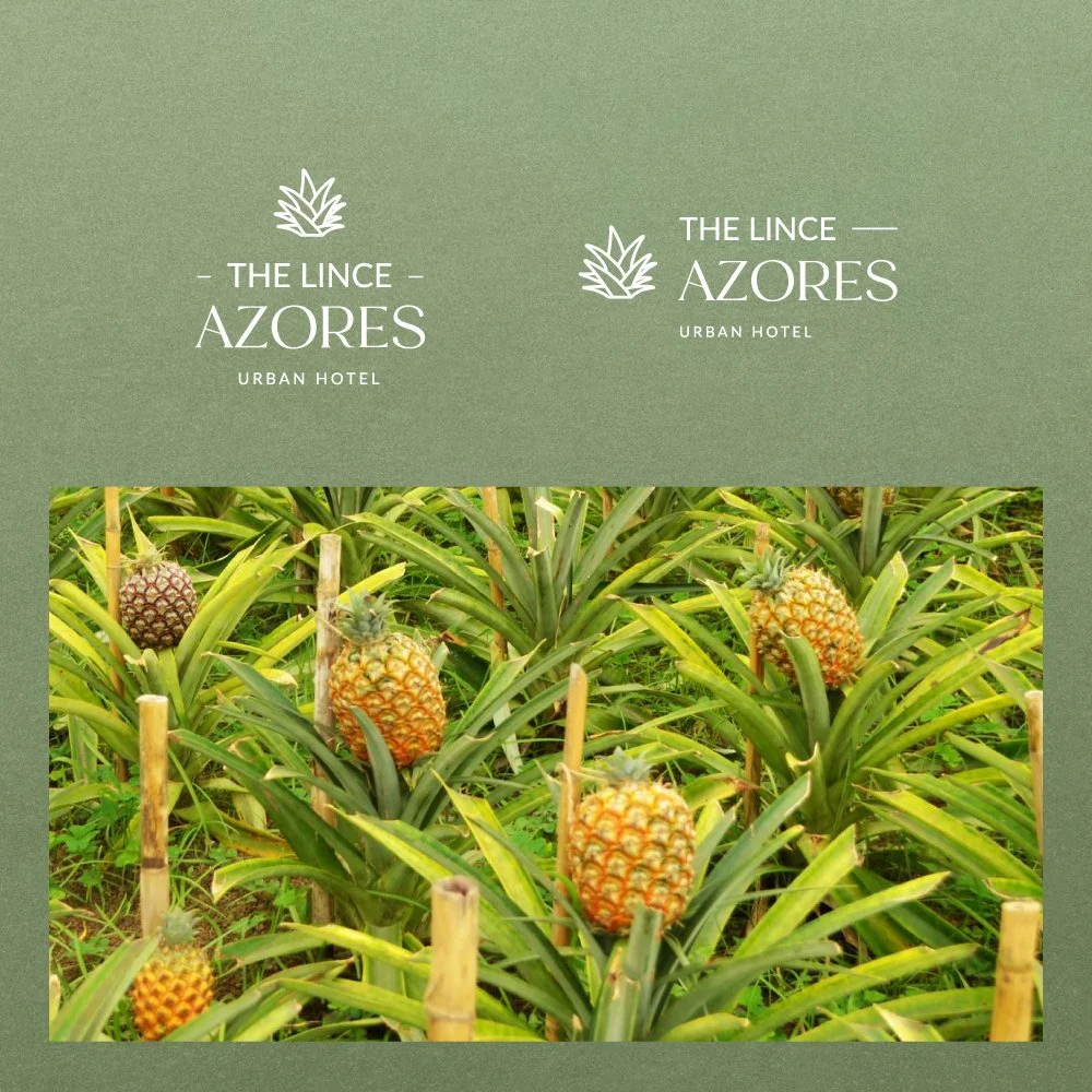
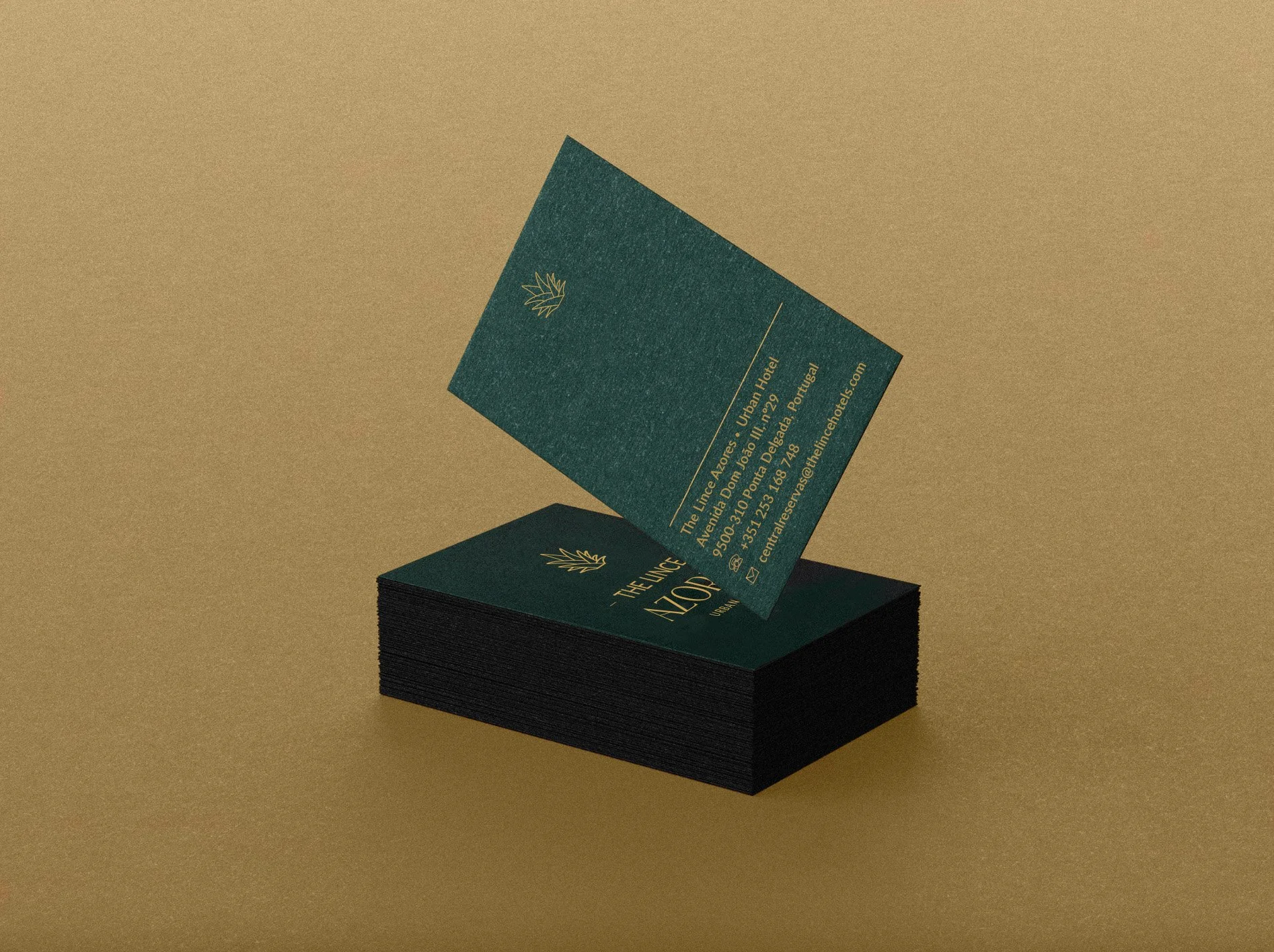
For the rebranding of The Lince Azores, an urban hotel located on São Miguel Island, the identity drew inspiration from the region’s iconic pineapple plantations, a symbol deeply connected to the Azorean culture and landscape. The logo features a stylized pineapple leaf motif, establishing a strong link to the hotel’s local surroundings while emphasizing its fresh and contemporary positioning.
To ensure adaptability across diverse touchpoints, the logo was created in both vertical and horizontal versions. Complementary applications and branded products were also developed, reinforcing the hotel’s connection to its environment and enhancing its distinctive identity within the group.
VISUAL DIRECTION
Patrícia Conde
Miguel Carvalho
IMPACT
The rebranding of The Lince Hotels & Resorts not only elevated the group’s visual identity but also laid the foundation for a cohesive and future-proof brand system. By redesigning the logo and creating tailored identities for each hotel, the project strengthened the brand’s positioning and improved its ability to connect with diverse audiences across different contexts.
Following the visual rebrand, the identity was extended into the digital space through a complete redesign of the group’s website and the websites of its individual hotels. This ensured a consistent brand experience across both physical and digital touchpoints, enhancing recognition, usability, and alignment with the group’s vision for expansion.


