
Farmácias Portuguesas, a 100% Portuguese product through the Saúda Card, provide benefits and proximity services to citizens across the country. This academic project aimed to explore new digital solutions and propose subscription plans that could make access to healthcare more practical, accessible, and integrated.
CLIENT COMPANY
EDIT. – Disruptive Digital Education
YEAR
2023
EXPERTISE
Problem Statement
Desk Research
User Interviews
Survey
Persona & Empathy Map
Benchmarking (Direct & Indirect)
User Journey
Card Sorting
Wireframes Low-Fi & Hi-Fi
UI Kit
User Testing (Screen recording)
Prototype
UX/UI Case Study
ROLE
UX/UI Designer
(Group Project - detailed below)
SEGMENT
Healthcare & Subscription Plans


RESEARCH METHODS
Problem Statement
Desk Research
User Interviews
Survey
Persona & & Empathy Map
Benchmarking
Competitor Analysis
User Journey
Card Sorting
User Testing
SOFTWARE & PLATFORMS
Figma & Figjam
Adobe Illustrator
Adobe Photoshop
Similar Web
IDEATION
Wireframes Low-Fi
Wireframes Hi-Fi
UI Kit
Visual Design
Prototype
PROJECT OVERVIEW
Users face challenges related to the availability and accessibility of pharmaceutical services. Among the main frustrations identified were: limited opening hours, uncertainty about medication availability, long queues, difficulty in managing prescriptions, and the inconvenience of having to travel when unwell. These obstacles highlighted the need for solutions that provide greater convenience, remote support, and services adapted to users’ daily routines.
CHALLENGE
The main challenge was to design subscription plans that genuinely addressed users’ needs, balancing convenience, accessibility, and trust. Beyond improving the individual experience, from medication pickup to online prescription renewal, an opportunity was also identified to strengthen the role of community pharmacies as a central point of healthcare in Portugal, creating a scalable digital model with the potential to generate added value for both the brand and the sector.


STARTING PROCESS
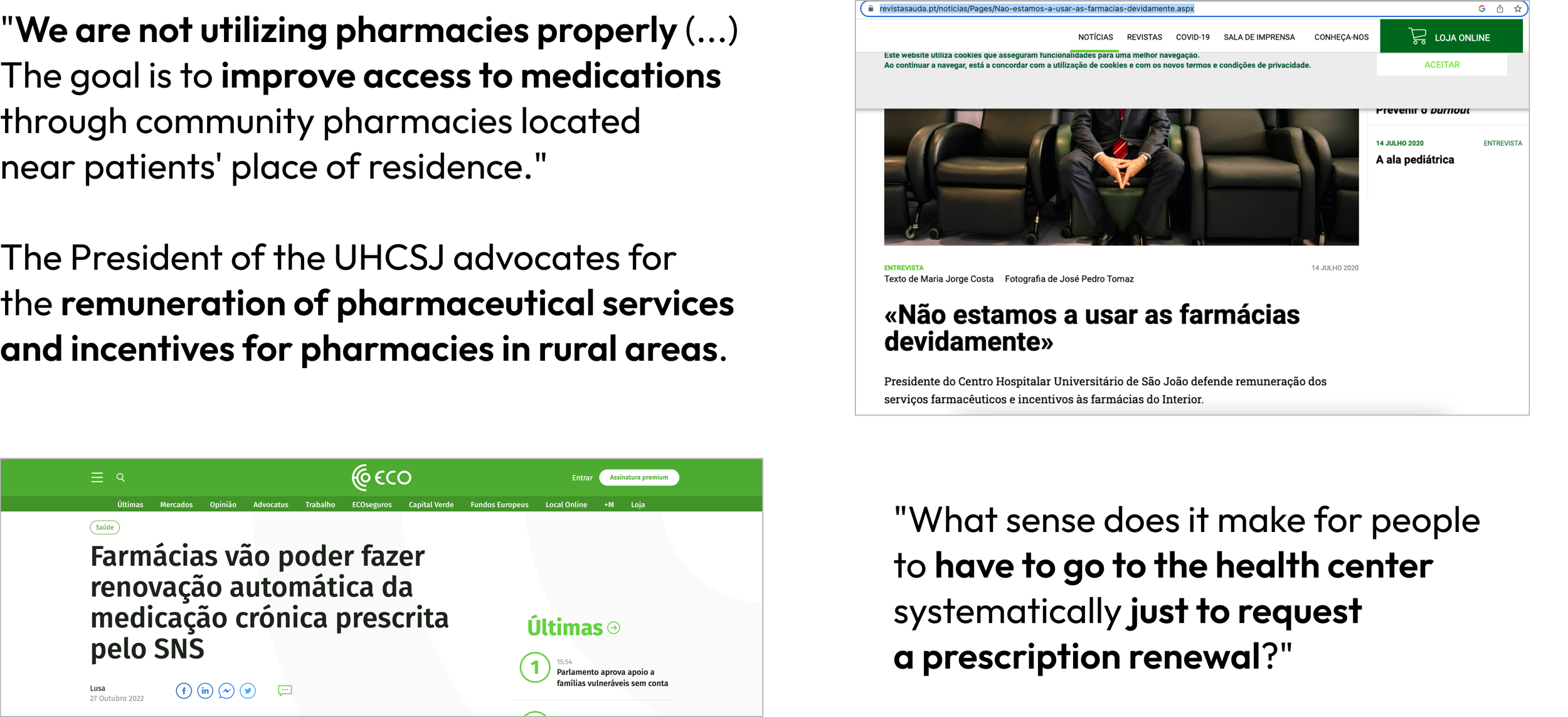
The project began with an evaluation of the role of Farmácias Portuguesas as a 100% Portuguese product and their relevance within the healthcare ecosystem. We explored their potential by analyzing accessibility, geographic coverage, and the wide range of services already offered to citizens.
At the same time, we identified gaps and opportunities highlighted in national reports and expert insights, which guided the definition of focus areas for the development of subscription plans and digital solutions.

REVIEWS
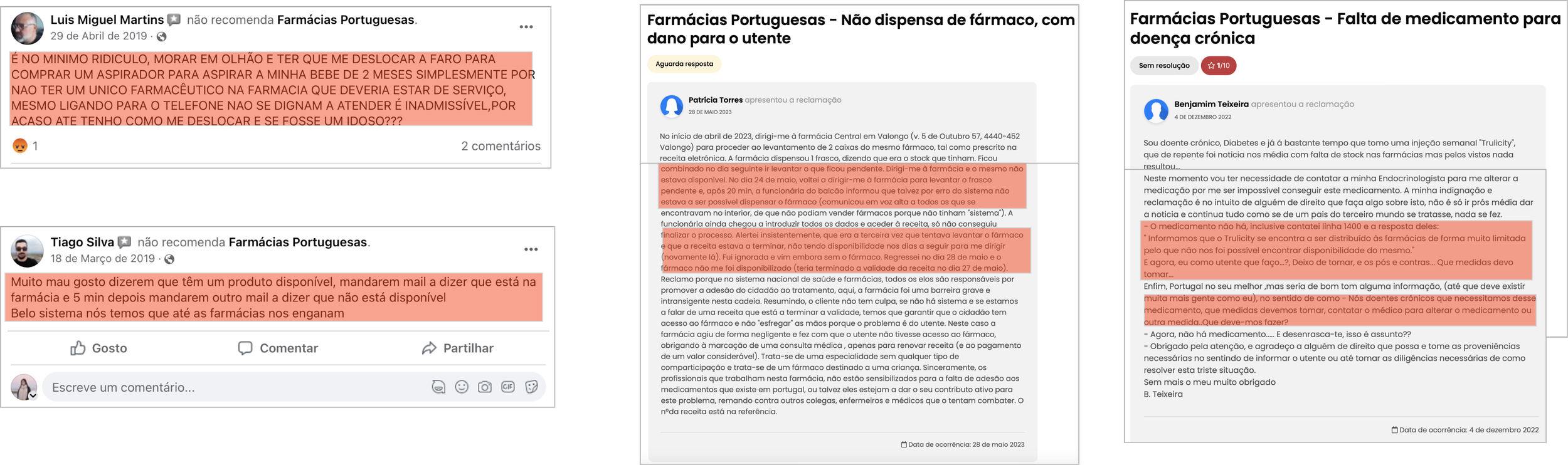
Collecting Qualitative Data
We analyzed the reviews left by users on Farmácias Portuguesas’ Facebook and Google pages. This allowed us to qualitatively evaluate their main frustrations, recurring complaints, and unmet needs, providing valuable insights to guide the next phases of research and design.
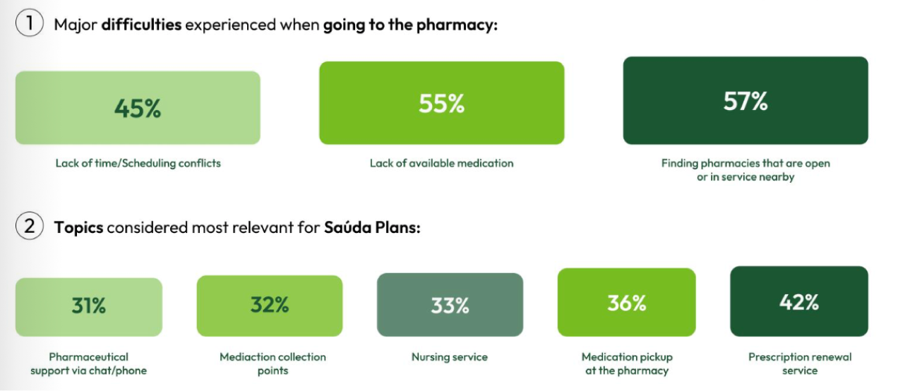
SURVEY
Collecting Quantitative Data
To complement the qualitative research, we conducted a survey with 53 participants to gather quantitative insights. The results highlighted the main difficulties when going to the pharmacy, such as lack of available medication (55%), finding open pharmacies nearby (57%), and scheduling conflicts (45%). Additionally, participants identified the most relevant features for Saúda subscription plans, with prescription renewal (42%) and medication pickup (36%) ranking highest, followed by nursing services (33%) and pharmaceutical support via chat or phone (31%).

INTERVIEWS & USABILITY TESTS
We conducted 12 user interviews to gather deeper insights into their daily routines and expectations regarding pharmacies and the Saúda Card. The interviews revealed recurring issues such as the need for home delivery of medication, easier prescription renewals, and the value of accessing promotions and personalized support.
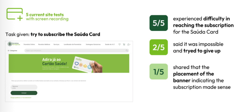
To complement these findings, we carried out 5 usability tests with screen recording on the current Saúda Card subscription process. All participants (5/5) reported difficulties reaching the subscription page, with 2/5 considering giving up entirely. Only 1/5 felt that the banner placement for the subscription made sense. These results highlighted clear usability problems and confirmed the importance of redesigning the digital experience.
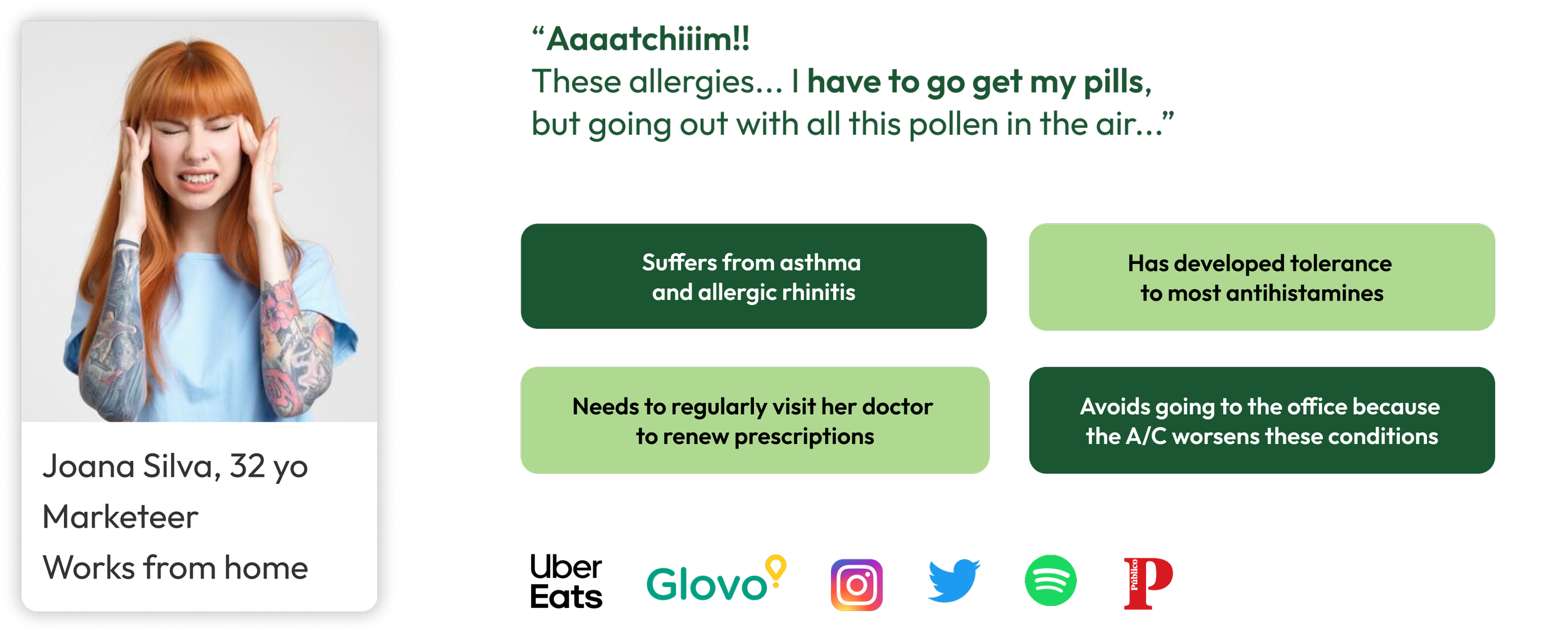


PERSONA & PROBLEM STATEMENT
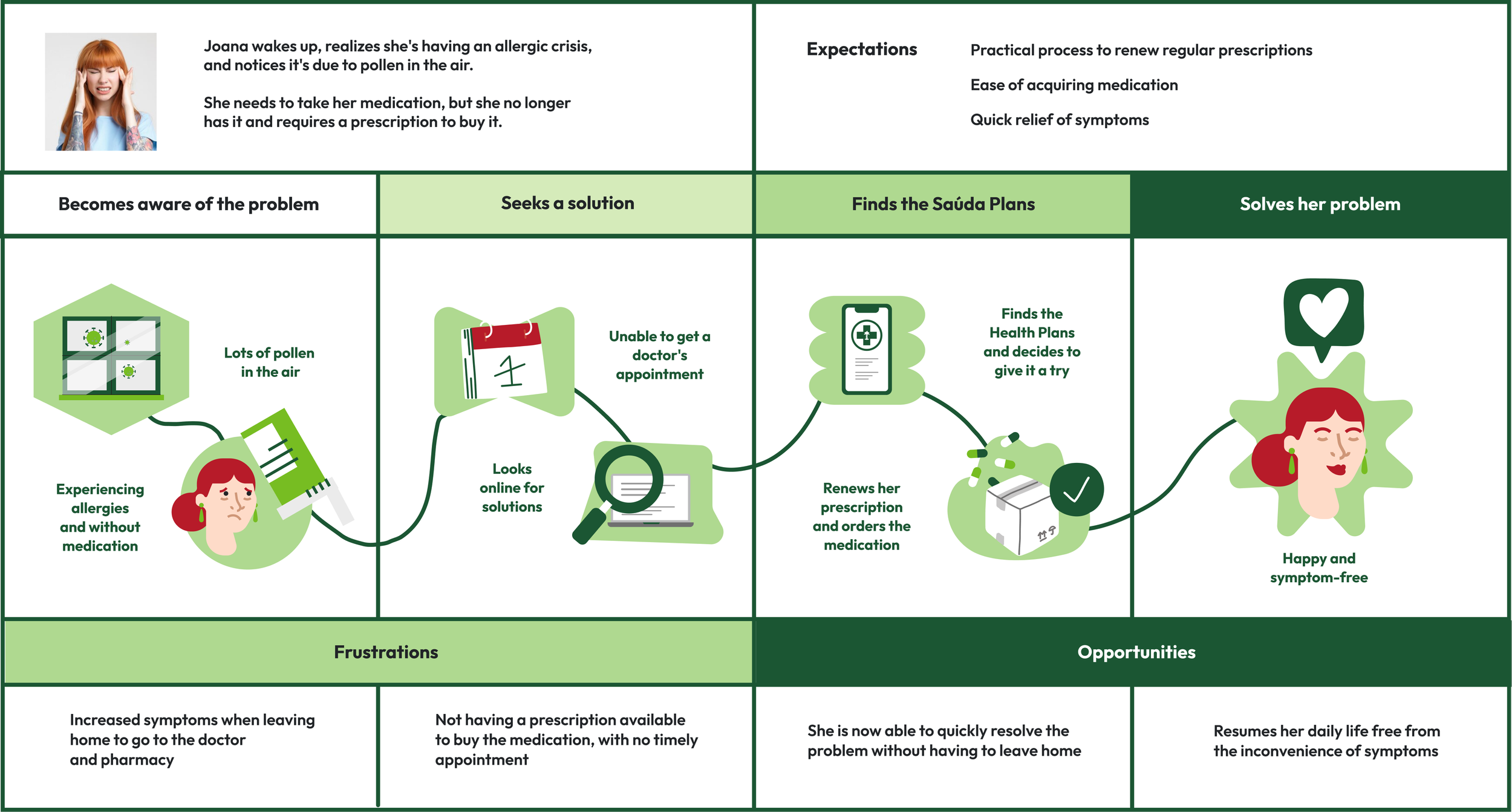
To better empathize with users, we created the persona Joana Silva, a 32-year-old marketeer who works from home and struggles with asthma and allergic rhinitis. Joana frequently needs prescription renewals and experiences discomfort when leaving the house, especially during allergy season.
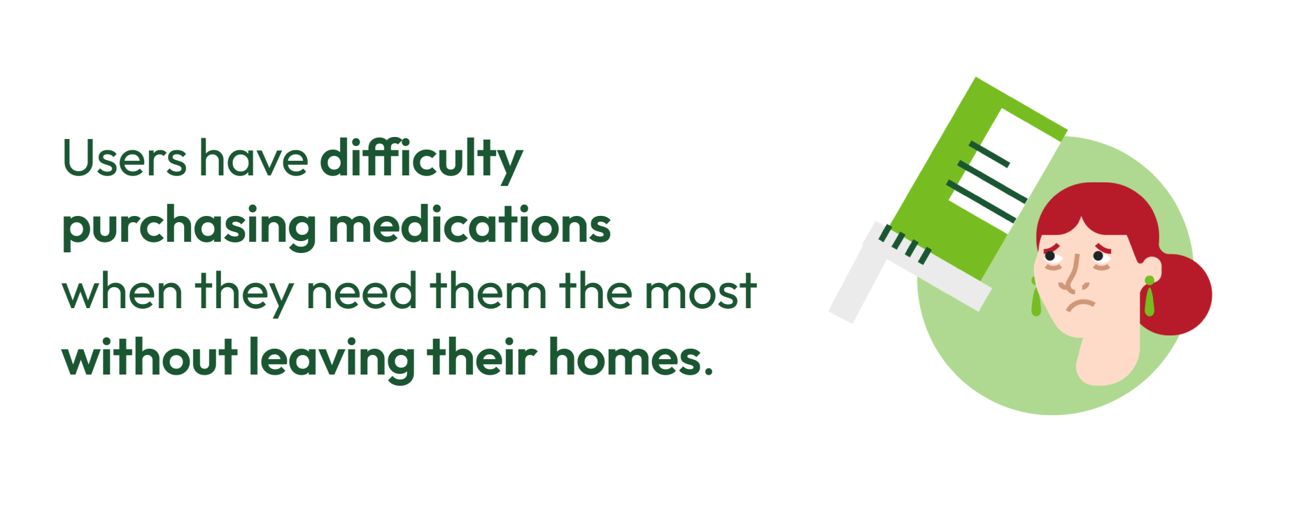
From this, we defined the problem statement: users face significant difficulties purchasing medications when they need them the most, particularly in situations where going to the pharmacy is inconvenient or harmful to their health. This highlighted the need for more accessible and flexible subscription-based solutions.
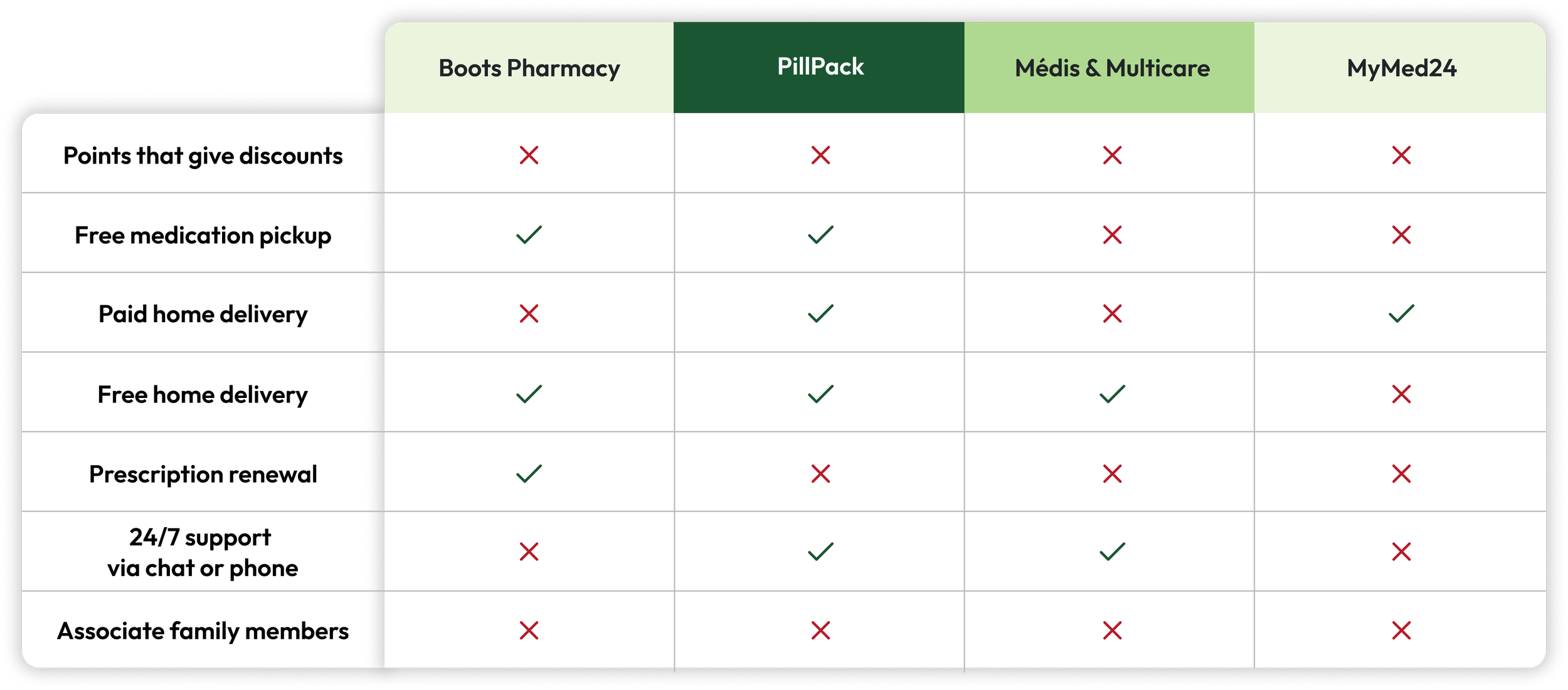
COMPETITIVE ANALYSIS & BENCHMARKING
We analyzed national and international competitors such as Boots, PillPack, Médis & Multicare, and MyMed24. The comparison revealed a fragmented offer, with few services combining convenience, accessibility, and added value. These insights helped identify gaps and opportunities for the Saúda subscription plans.
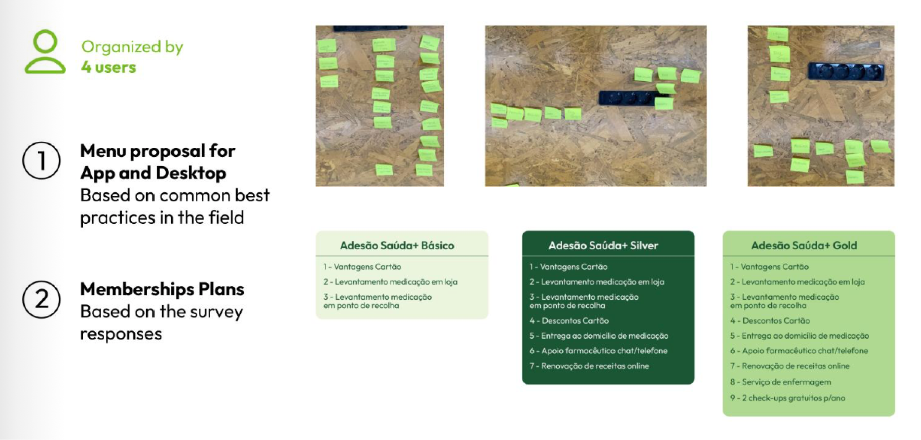

CARD SORTING
We conducted a card sorting exercise with 4 users to organize the menu structure for both app and desktop. This activity helped validate common best practices while also shaping the Saúda+ membership plans. Based on survey insights, the final proposal included three levels of subscription, Basic, Silver, and Gold, each tailored to different user needs and expectations.

USER JOURNEY
The user journey maps Joana’s experience from facing an allergy crisis without medication to resolving her problem through the Saúda Plans. Initially frustrated by the difficulty of obtaining a prescription and accessing a pharmacy, she finds a solution online, renews her prescription, and orders her medication. This process highlights both the frustrations of the current system and the opportunities for Saúda Plans to provide quick, convenient, and symptom-free relief.
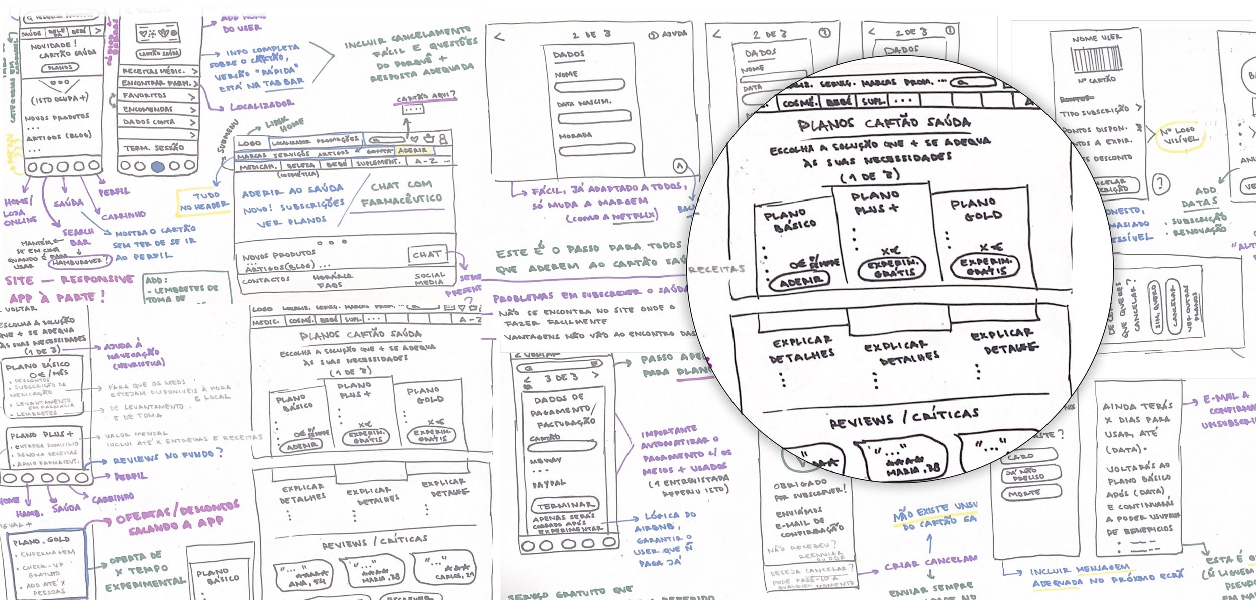
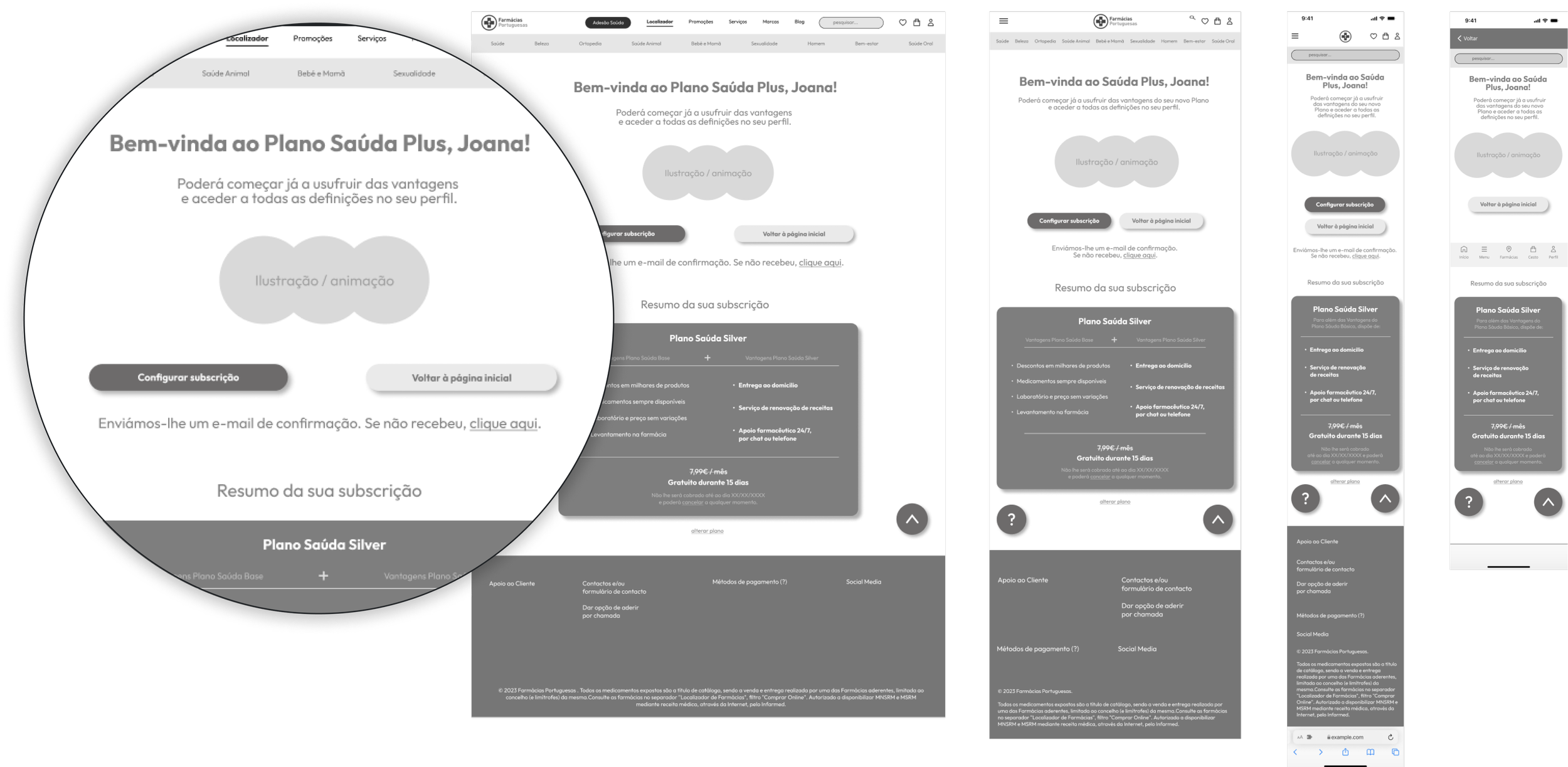

We started with low-fidelity wireframes, exploring different layouts and user flows to structure the subscription plans and essential features of the platform. These sketches allowed us to quickly iterate ideas and test navigation logic. The process then evolved into mid-fidelity wireframes, where we refined the hierarchy, content organization, and user interactions, preparing the ground for usability testing and visual design.
WIREFRAMES LOW-FI & WIREFRAMES MID-FI
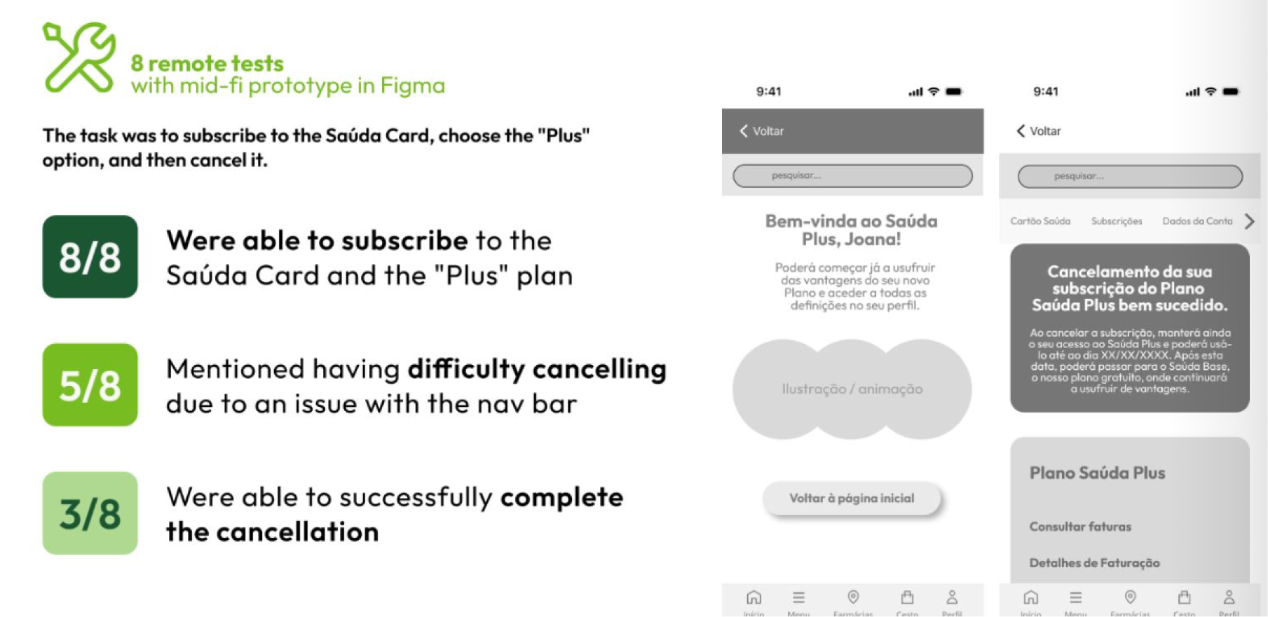
USABILITY TESTS
We conducted 8 remote usability tests with the mid-fidelity prototype in Figma. All participants (8/8) were able to subscribe to the Saúda Card and the “Plus” plan. However, 5/8 reported difficulties when trying to cancel due to navigation bar issues, and only 3/8 successfully completed the cancellation process.
These findings highlighted the need to improve navigation clarity and simplify the cancellation flow.
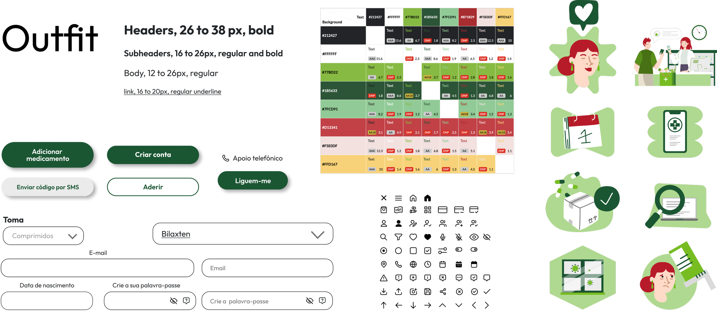
UI KIT
The UI Kit was developed to ensure consistency and accessibility across the platform. It included typography guidelines using the Outfit font, a complete color palette tested for accessibility, reusable components such as buttons and form fields, and a custom icon set. In addition, a series of illustrations was designed to support the visual identity, making the interface more engaging and user-friendly.
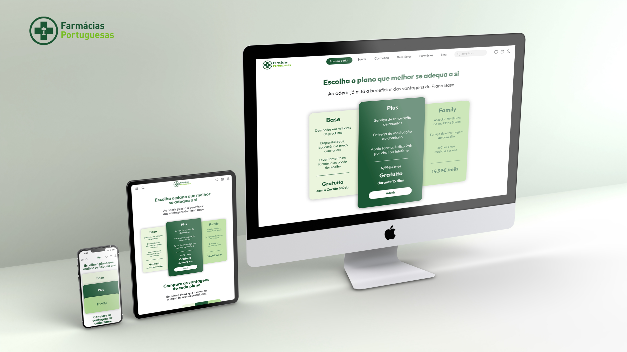
RESPONSIVE LAYOUT
The subscription plans were designed with a fully responsive layout, ensuring a consistent and intuitive experience across devices. From mobile to tablet and desktop, the interface adapts seamlessly, allowing users to compare plans and subscribe with ease, regardless of the platform they use.
TEAM
João Almeida
Mário Silva
Raquel Brotas
Sara Pereira
MENTORS
Francisco Mouga
Hugo Oliveira Vieira
Rui Soares
IMPACT
The project resulted in the design of a digital subscription model for the Saúda Card, addressing key user needs such as easier prescription renewals, improved access to medication, and additional health services. By combining qualitative and quantitative research, competitive analysis, card sorting, and usability testing, the final prototype provided a clear and intuitive solution aligned with real user expectations.
This not only enhanced the user experience by making healthcare services more accessible and convenient but also highlighted the opportunity for Farmácias Portuguesas, a 100% Portuguese product, to strengthen its digital presence and create a scalable model of added value for both citizens and the healthcare sector.