
The Lince Hotels & Resorts is a hotel chain with properties across mainland Portugal and the islands, offering guests unique experiences that combine comfort, hospitality, and local authenticity. Each location embraces the spirit of its region, providing stays that blend well-being, gastronomy, and culture.
CLIENT COMPANY
The Lince Hotels & Resorts, Portugal
YEAR
2023
EXPERTISE
Heuristic Evaluation
User Research
UX/UI Design
Web Design
Visual Design
UI Kit
Prototype
UX/UI Case Study
ROLE
UX/UI Designer
SEGMENT
Hospitality, Hotels & Resorts
RESEARCH METHODS
Heuristic Evaluation
Market Research
Competition Analysis
Benchmarking
Sitemap Definition
IDEATION
Wireframes Low-Fi
Wireframes Hi-Fi
UI Kit
Visual Design
Prototype
SOFTWARE & PLATFORMS
Figma & Figjam
Adobe Illustrator
Adobe Photoshop
Treejack (for Tree Testing)
PROJECT OVERVIEW
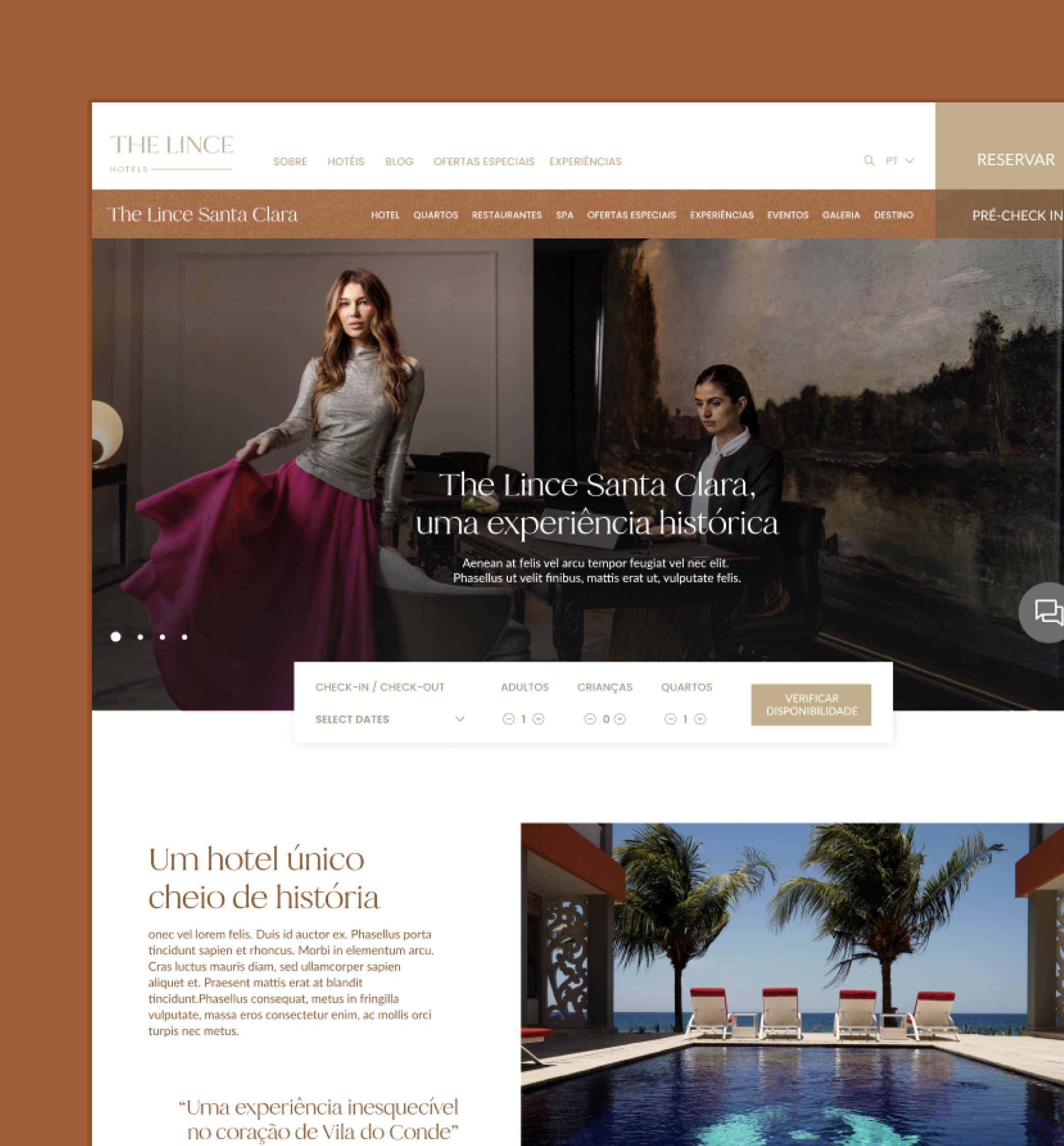
The project focused on the redesign of The Lince Hotels & Resorts website, as the previous version was visually outdated and lacked development compared to competitors in the hospitality sector. The goal was to create a modern, elegant, and user-friendly platform that strengthens the brand’s digital presence and delivers a seamless experience for potential guests.
CHALLENGE
The main challenge was to update and elevate the hotel chain’s online identity, ensuring it could stand out in a highly competitive market. This required analyzing the existing website, conducting benchmarking against leading competitors, and defining a new visual and functional direction.
The outcome was the design of a more intuitive and engaging website experience, aligning with both the expectations of modern travelers and the premium positioning of the brand.

STARTING PROCESS
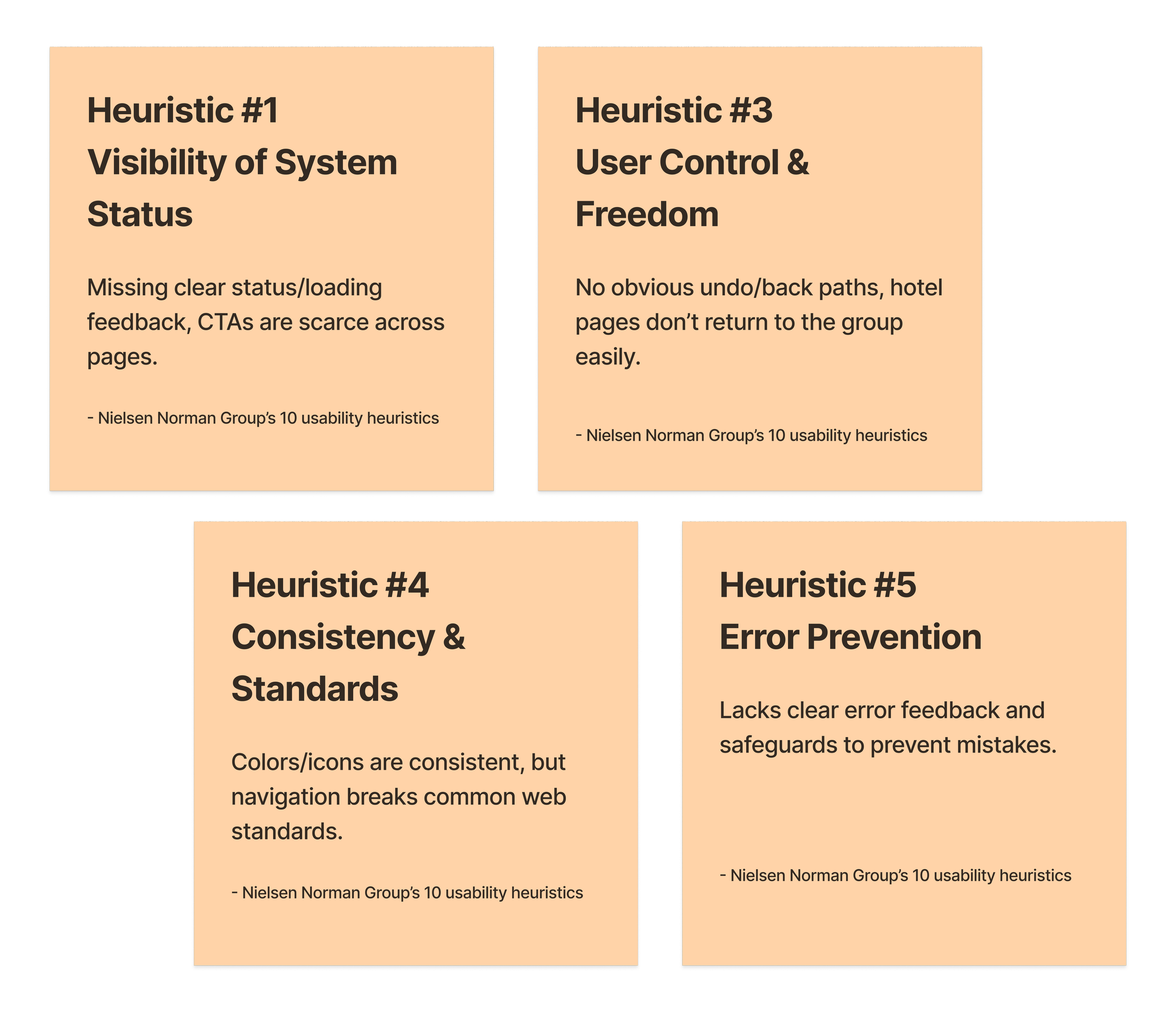
Heuristic Evaluation
The project began with a heuristic evaluation of the existing website to identify usability issues and define which errors to avoid in the redesign. This evaluation was based on the Nielsen Norman Group’s 10 usability heuristics, a widely recognized set of best practices in user experience. Each numbered note in the analysis corresponds to these principles, helping establish a clearer direction for improvement and ensuring a more consistent, user-centered outcome.
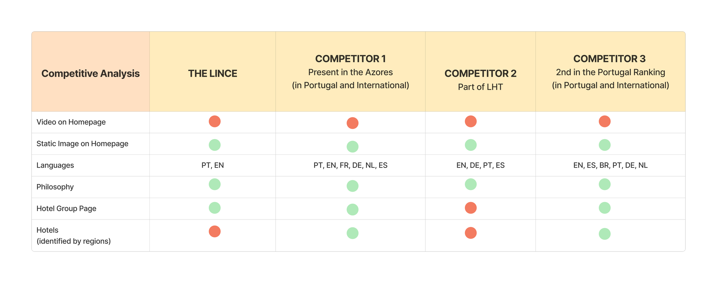
VISUAL BENCHMARKING & COMPETITIVE ANALYSIS
To guide the redesign process, I conducted a visual benchmarking analysis of direct competitors, including hotel chains with presence both in Portugal, across the islands, and internationally. This step was followed by an extensive competitive analysis, which helped identify market opportunities and highlight patterns adopted by competitors.
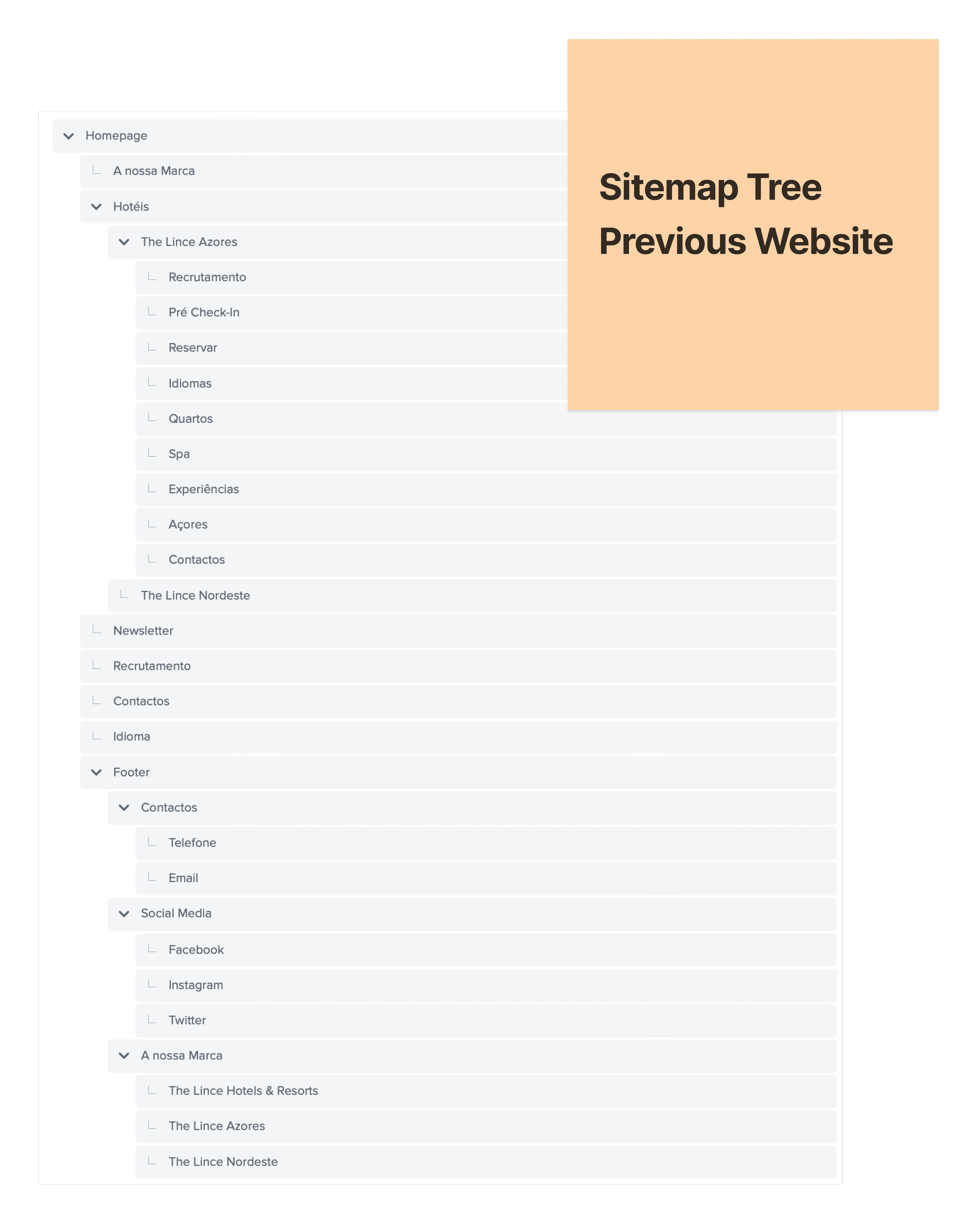
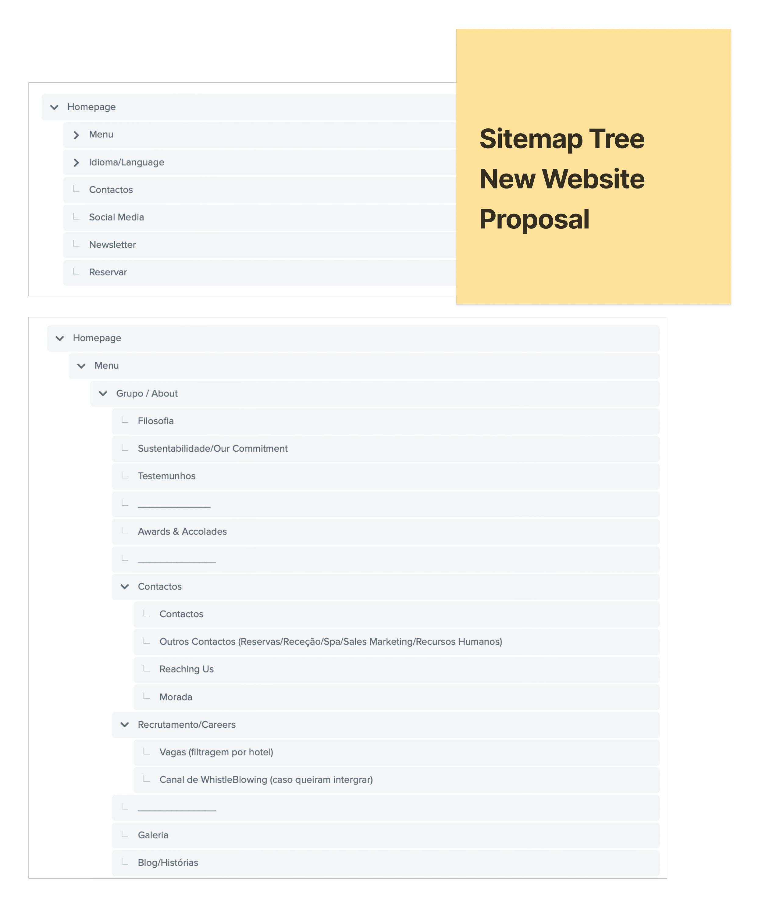
SITEMAP & TREE TESTING
I felt the need to reassess the existing website’s sitemap, so I conducted tree testing using Treejack. This process helped validate where each topic should be placed, ensuring a clearer and more justified site structure.

WIREFRAMES LOW-FI & VISUAL BENCHMARKING
At this stage, I began sketching the first low-fidelity wireframes on paper. To support some of the design decisions, I used competitor references, such as navigation bars and layout patterns, as a benchmark for industry standards.

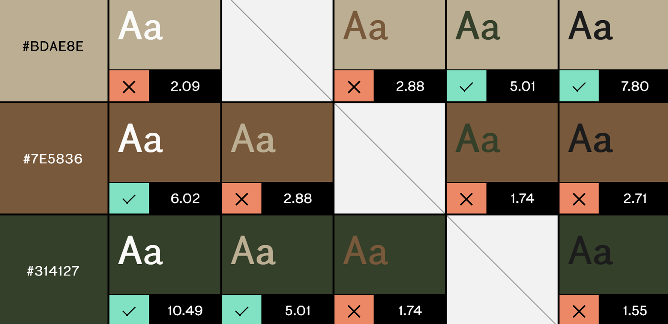
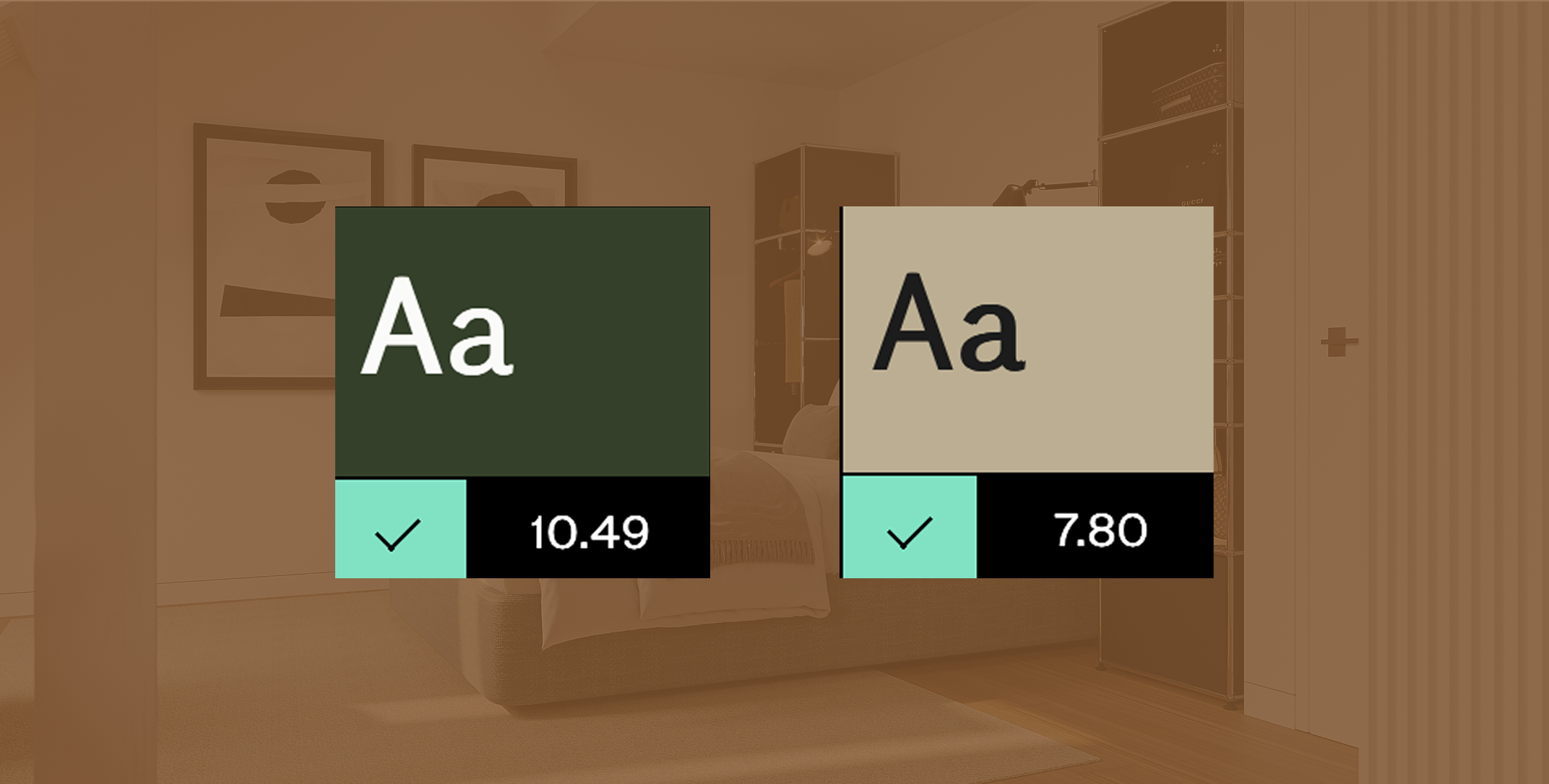
UI KIT & ACCESSIBLE COLORS CONTRAST
A UI Kit was created based on the brand’s identity colors, ensuring consistency across all visual elements. Color combinations were tested for accessibility contrast, guaranteeing readability and compliance with accessibility standards on different devices. This approach ensured that the design remained both visually aligned with the brand and user-friendly for all audiences.
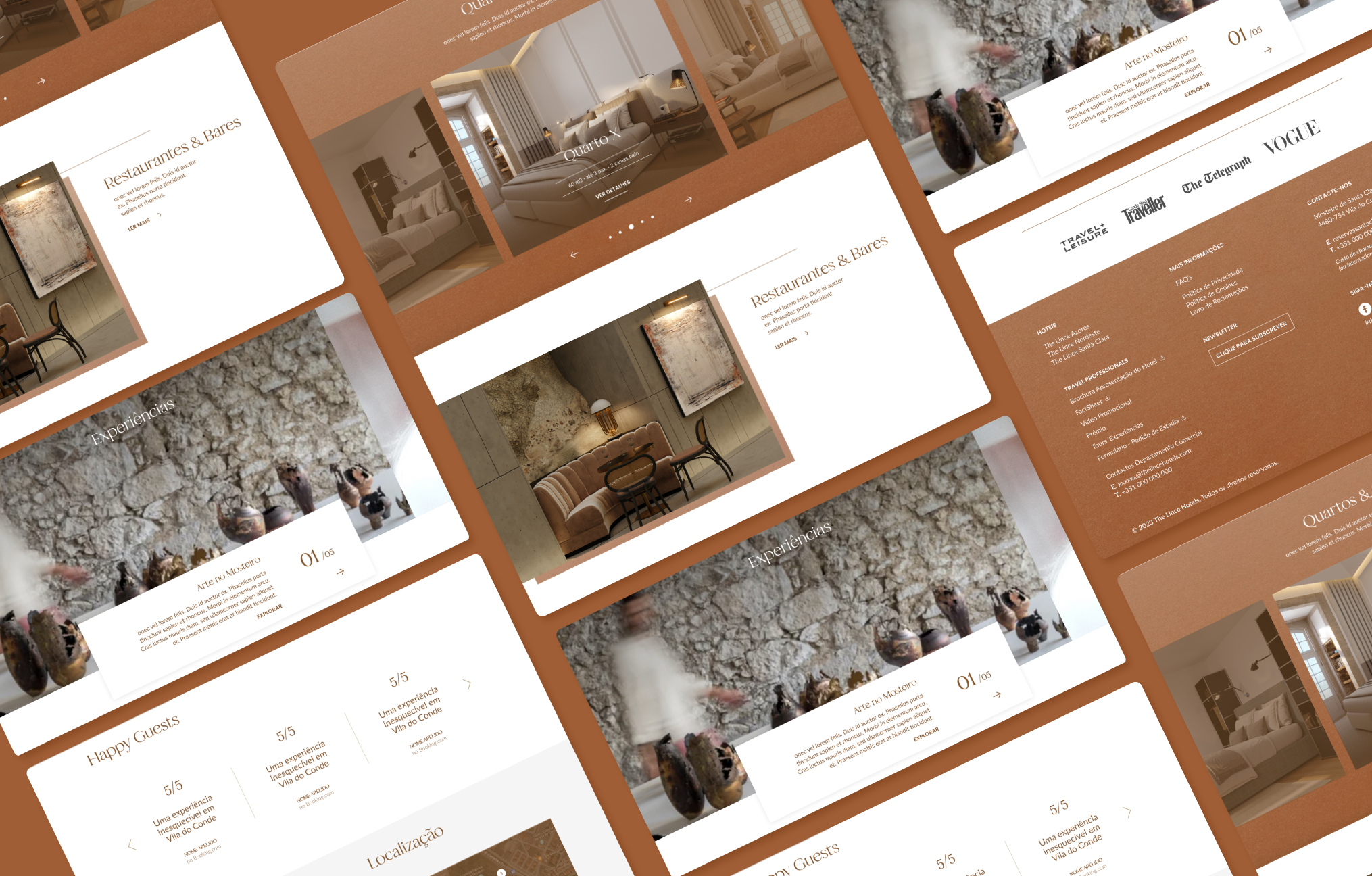
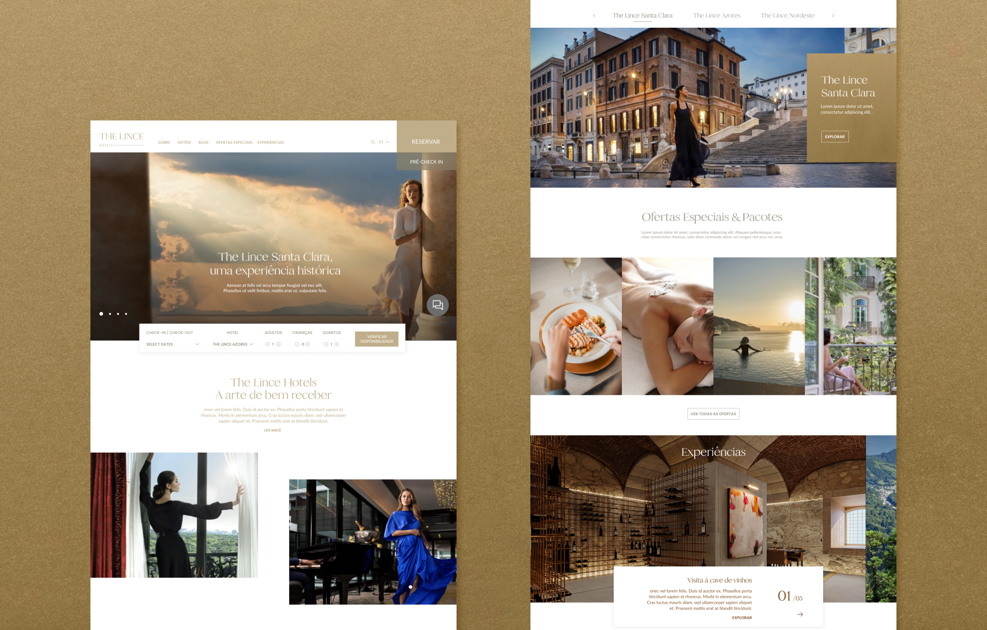
VISUAL DIRECTION
Patrícia Conde
Miguel Carvalho
WORDPRESS DEVELOPER
Pedro Palrão
IMPACT
Although the final outcome did not fully match my initial vision due to development limitations, the project still represented a significant improvement compared to the previous website. The redesign brought a clearer structure, modern visuals, and a more user-friendly experience, which resulted in highly positive feedback from both the client and users.