
Algo is a small studio founded by Rúben Lourenço, dedicated to exploring the possibilities of ceramics through texture, color, and material experimentation. The project reflects a contemporary approach to craftsmanship, where each piece embodies both artistic exploration and functional design.
CLIENT COMPANY
Algo - Rúben Lourenço
YEAR
2025
SEGMENT
Visual Identity Development, Branding, Brand System, Brandbook
ROLE
Brand Designer
Visual Identity & Brand Guidelines
EXPERTISE
Brand Identity
Color & Typography System
Pattern & Graphic Applications
Brandbook Creation
Brand Consistency
Branding Case Study
IDEATION
Brand Concept / Visual Identity
Color Palette & Typography Selection
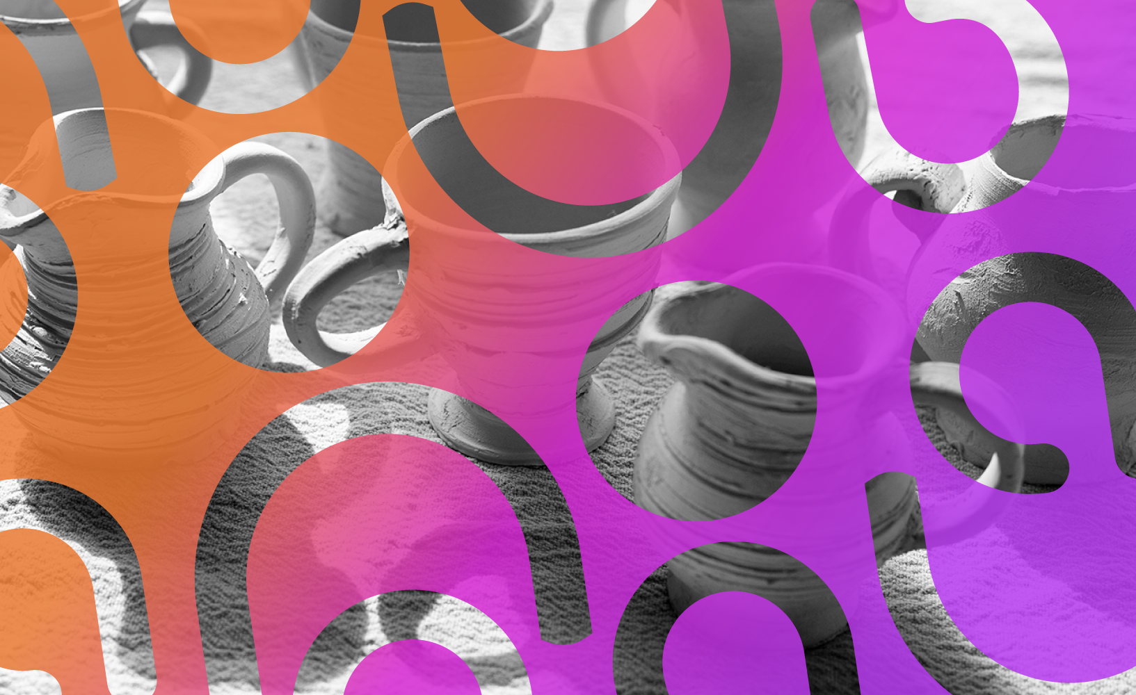
Pattern Design & Brand Applications
Brandbook Guidelines
SOFTWARE & PLATFORMS
Figjam
Adobe Illustrator
Adobe Photoshop
Adobe InDesign
Accessible Brand Colors
PROJECT OVERVIEW
The focus of this project was the development of a comprehensive set of brand guidelines to ensure consistency across all visual applications. From the logo system to color palette, typography, and graphic patterns, each element was carefully crafted to reflect the studio’s experimental and tactile essence.
CHALLENGE
The main challenge was to guarantee that the brand identity authentically represented the client’s artistic vision. Since Algo thrives on experimentation and variety, it was essential to design a flexible system that could adapt to different contexts without losing coherence. This required an ongoing dialogue with the client, refining visual elements until they resonated with his perspective and successfully translated the essence of the studio into a consistent and distinctive identity.
STARTING PROCESS
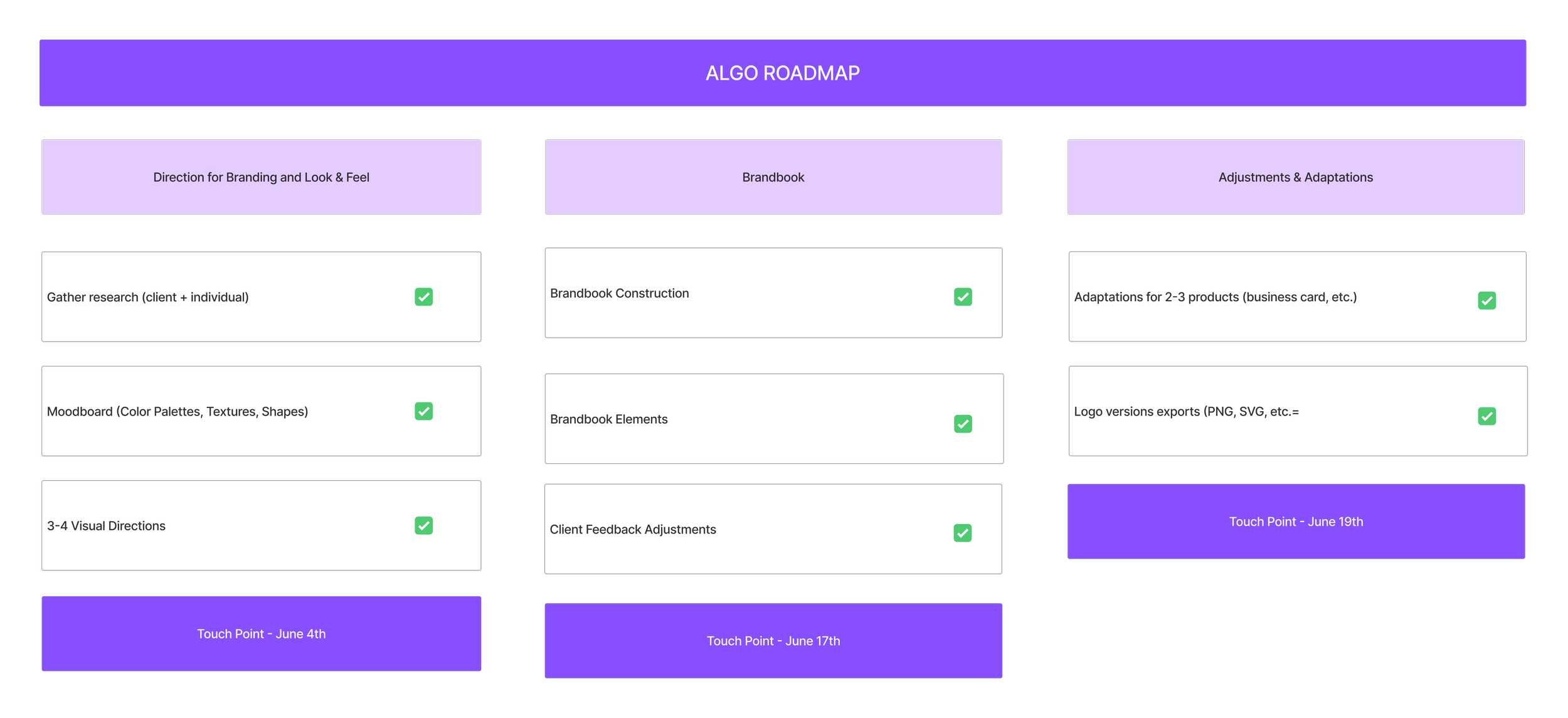
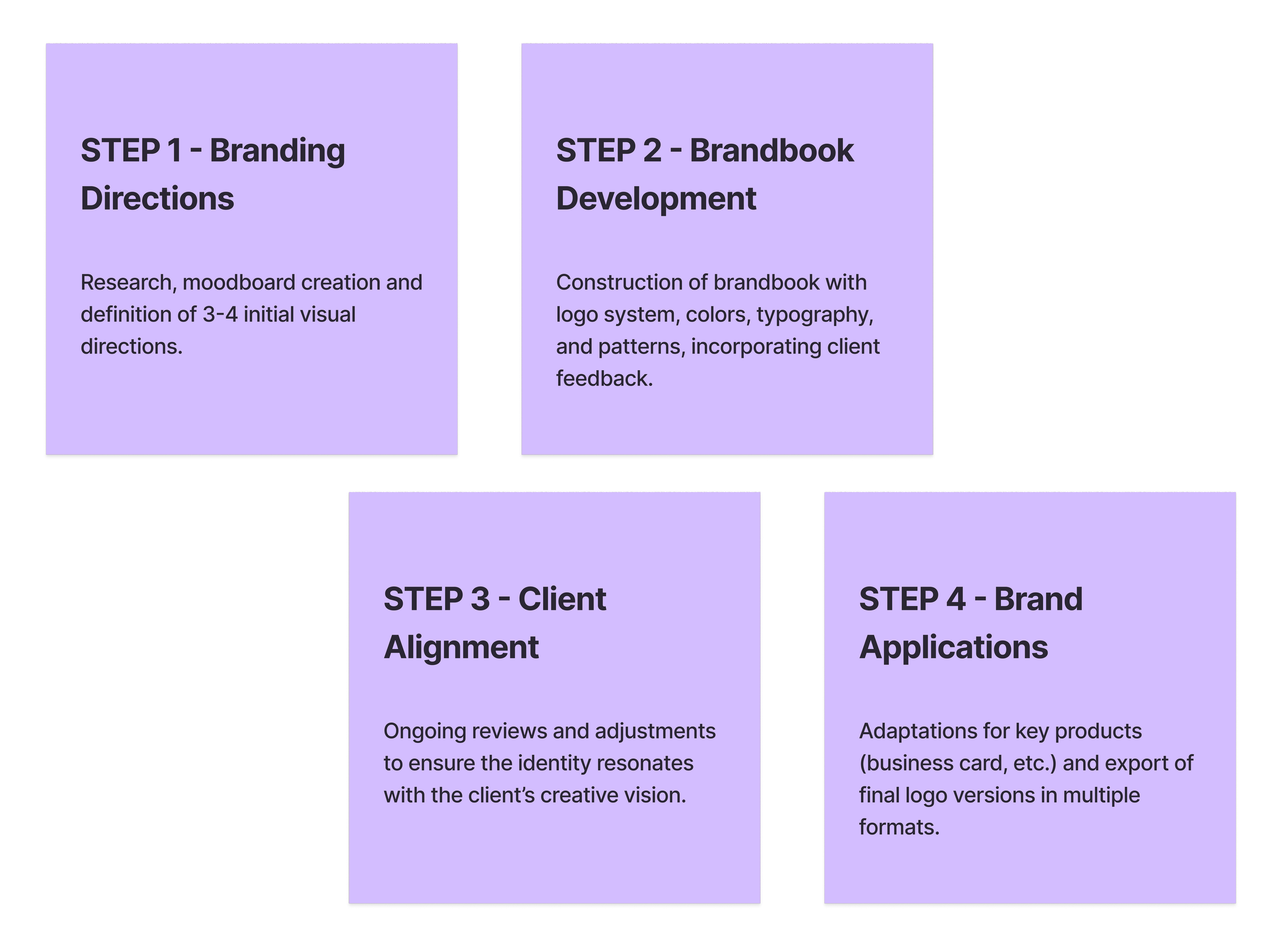
The project began with the creation of a clear roadmap, designed to help both myself and the client follow the process step by step and manage expectations effectively.
The client had already developed an initial draft and early logo explorations, which became the starting point for our work. From there, I gathered visual references, including photographs of his ceramic pieces and examples of brands he identified with, to better understand the essence of Algo. At the same time, I conducted market research to analyze existing identities within the field and identify potential opportunities for differentiation and positioning.
VISUAL DIRECTION
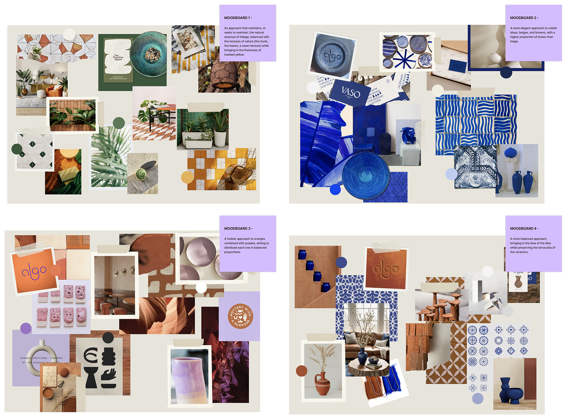
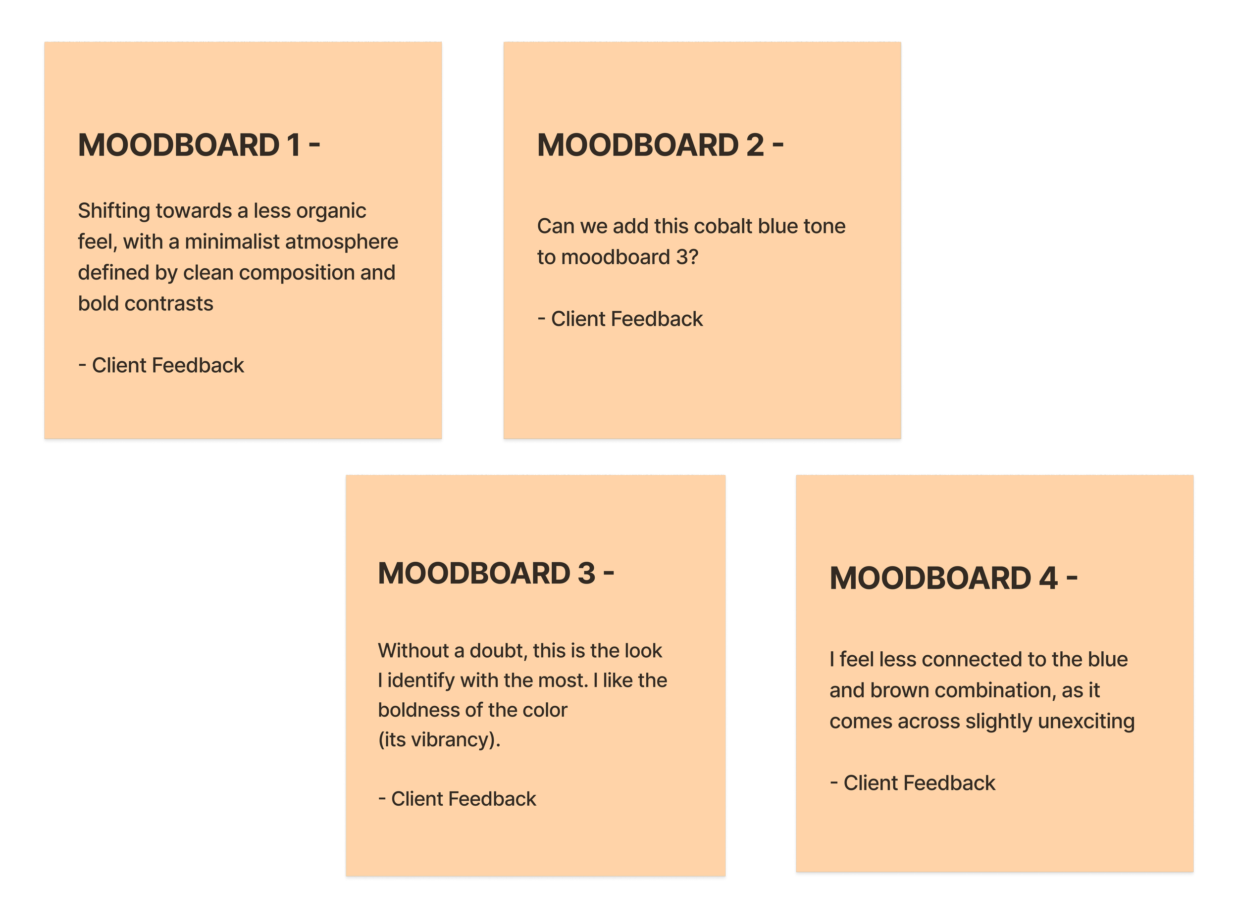
To capture the essence of Algo, I developed four distinct moodboards, each exploring different color palettes, textures, and atmospheres. This allowed the client to evaluate multiple directions and identify which one resonated most.
Alongside the moodboards, I created small sketches to illustrate potential applications, helping visualize how each concept could evolve. After reviewing the options, the client chose Moodboard 3, defined by bold purples and oranges, with the additional request to incorporate cobalt blue for greater vibrancy.


BRANDBOOK DEVELOPMENT
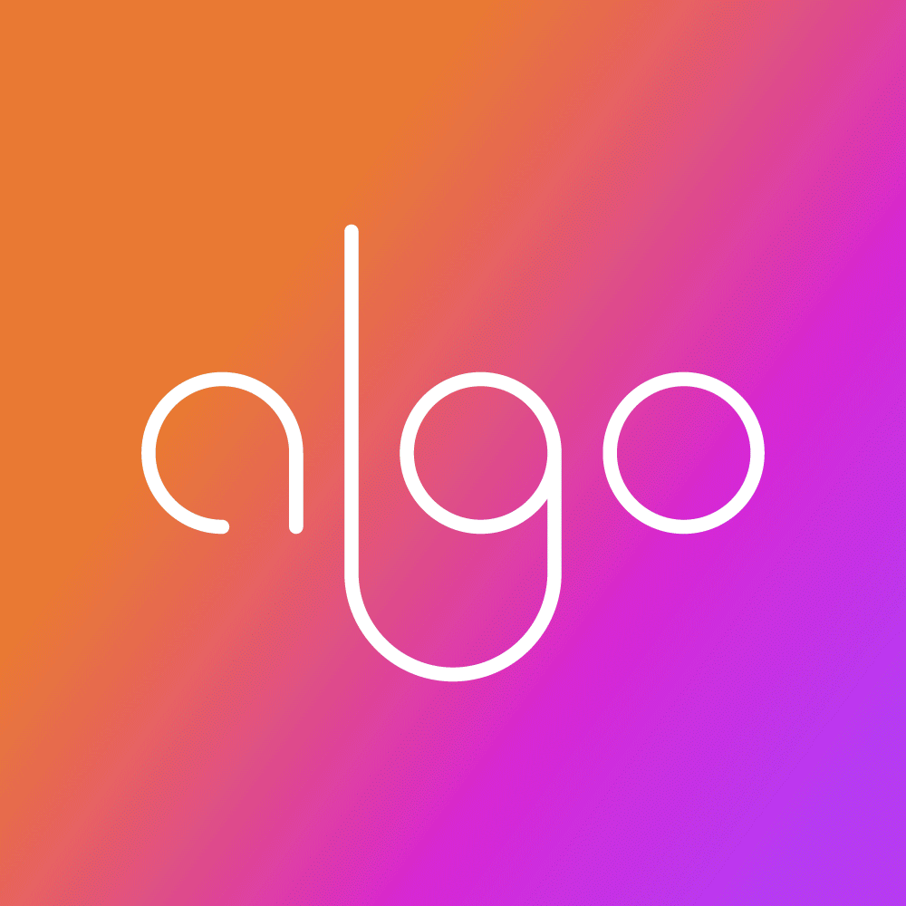
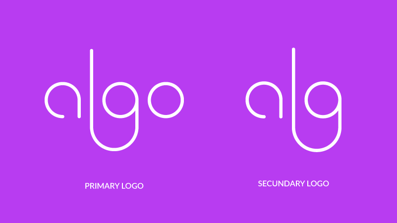
After defining the primary and secondary logo through an exploration of construction lines and proportions, I organized the full visual identity into a structured brandbook. This document compiled all essential guidelines to guarantee consistency across applications: logo usage, construction grid, variations, safe margins, restrictions, and adaptations for different backgrounds.
Additionally, it established the brand’s chromatic system, including the main and neutral palettes, gradients, and typography, as well as the use of patterns and graphic applications. The brandbook was designed as a practical tool to support future communication, ensuring coherence and clarity in every visual expression of Algo.

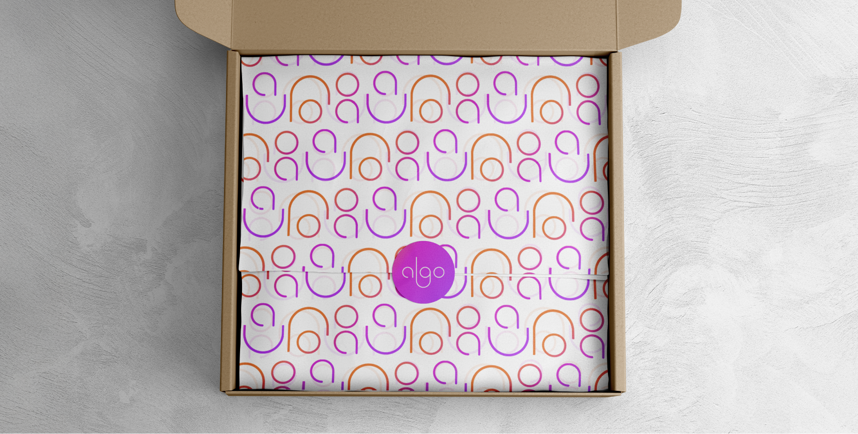
BRAND APPLICATIONS
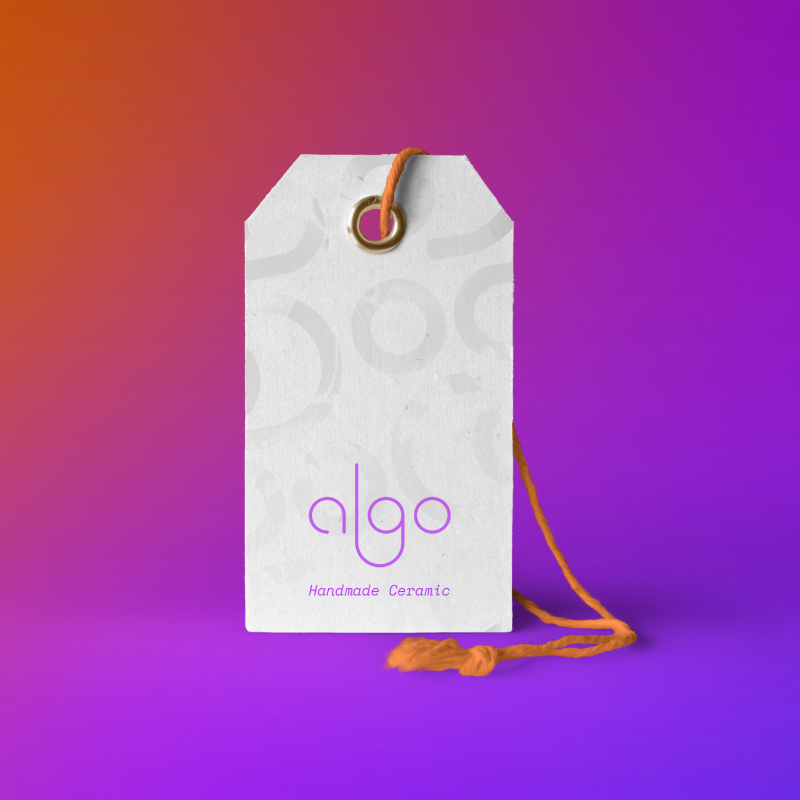
After refining the identity and aligning each step with the client’s vision, I moved forward with applications across different materials. This stage allowed the client to see how the brand would behave as a whole, beyond isolated elements such as color, logo, or patterns, and instead experience the identity integrated into real products.
These applications provided a tangible preview of how Algo visual system could adapt consistently while enhancing its presence across multiple touchpoints.