
TAP Air Portugal is the country’s flagship airline, connecting Portugal to destinations worldwide. Despite its strong market presence, its digital platforms still face usability challenges. This academic project, developed in partnership with TAP and EDIT., focused on improving the user experience of the airline’s main website.
CLIENT COMPANY
TAP Air Portugal X EDIT. – Disruptive Digital Education
Partnership for 360º Project
YEAR
2023
EXPERTISE
Desk Research
Survey
Interviews
Persona
Problem Statement
Benchmarking (Direct & Indirect)
Usability Tests
UI Kit
Prototype
UX/UI Case Study
ROLE
UX/UI Designer
(Group Project - detailed below)
SEGMENT
Travel & Airline Services

SOFTWARE & PLATFORMS
Figma & Figjam
Adobe Illustrator
Adobe Photoshop
Similar Web
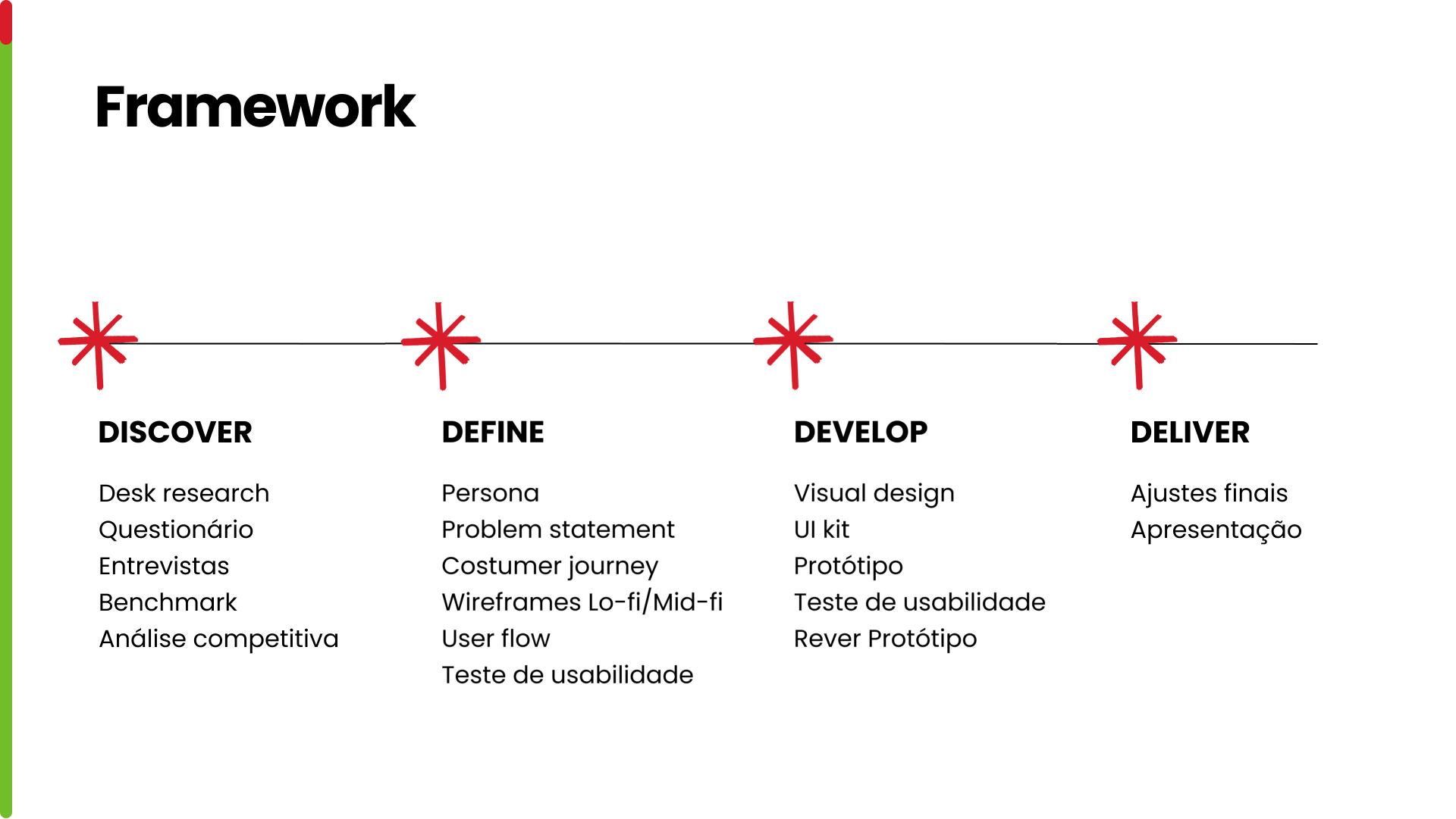
RESEARCH METHODS
Desk Research
Survey
Interviews
Persona
Problem Statement
Benchmarking (Direct & Indirect)
Usability Tests
IDEATION
Wireframes Low-Fi
Wireframes Hi-Fi
UI Kit
Visual Design
Prototype
PROJECT OVERVIEW
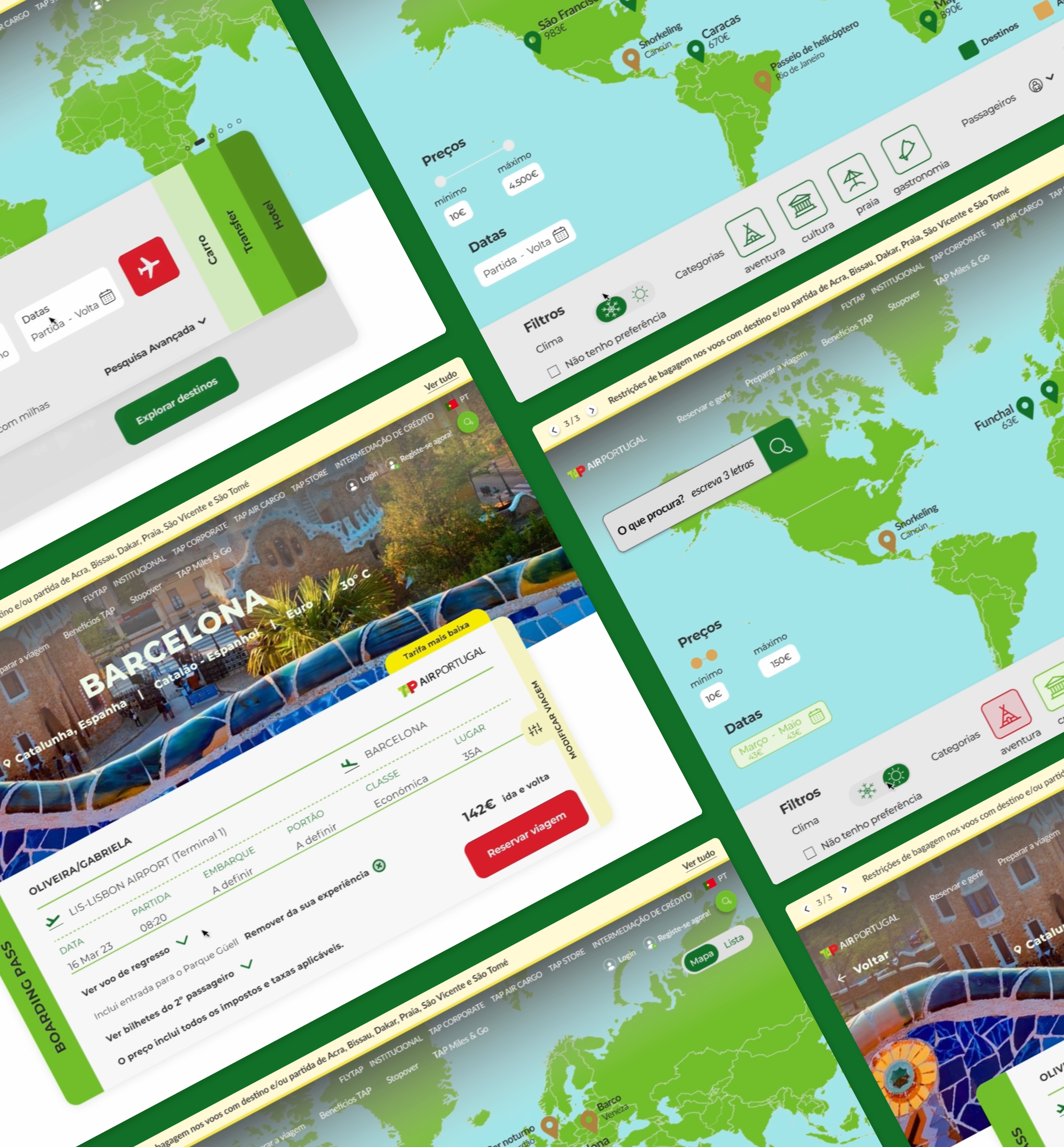
The project aimed to redesign and enhance the search bar on the flytap.com homepage, a core feature for users booking flights. Our goal was to simplify and optimize the process of searching for travel options by integrating a more intuitive and user-friendly search component. The redesign considered different user scenarios, particularly those where travelers do not have a fixed date or destination in mind, ensuring that the tool could adapt to varied needs.
CHALLENGE
The main challenge was to create a search experience that addressed real user pain points. Many users struggled to find affordable flights when they lacked specific travel dates or destinations. At the same time, they needed a tool that could reflect personal constraints, such as budget. This presented an opportunity not only to improve the user experience but also to strengthen TAP’s positioning as a more customer-centric airline in the digital space.
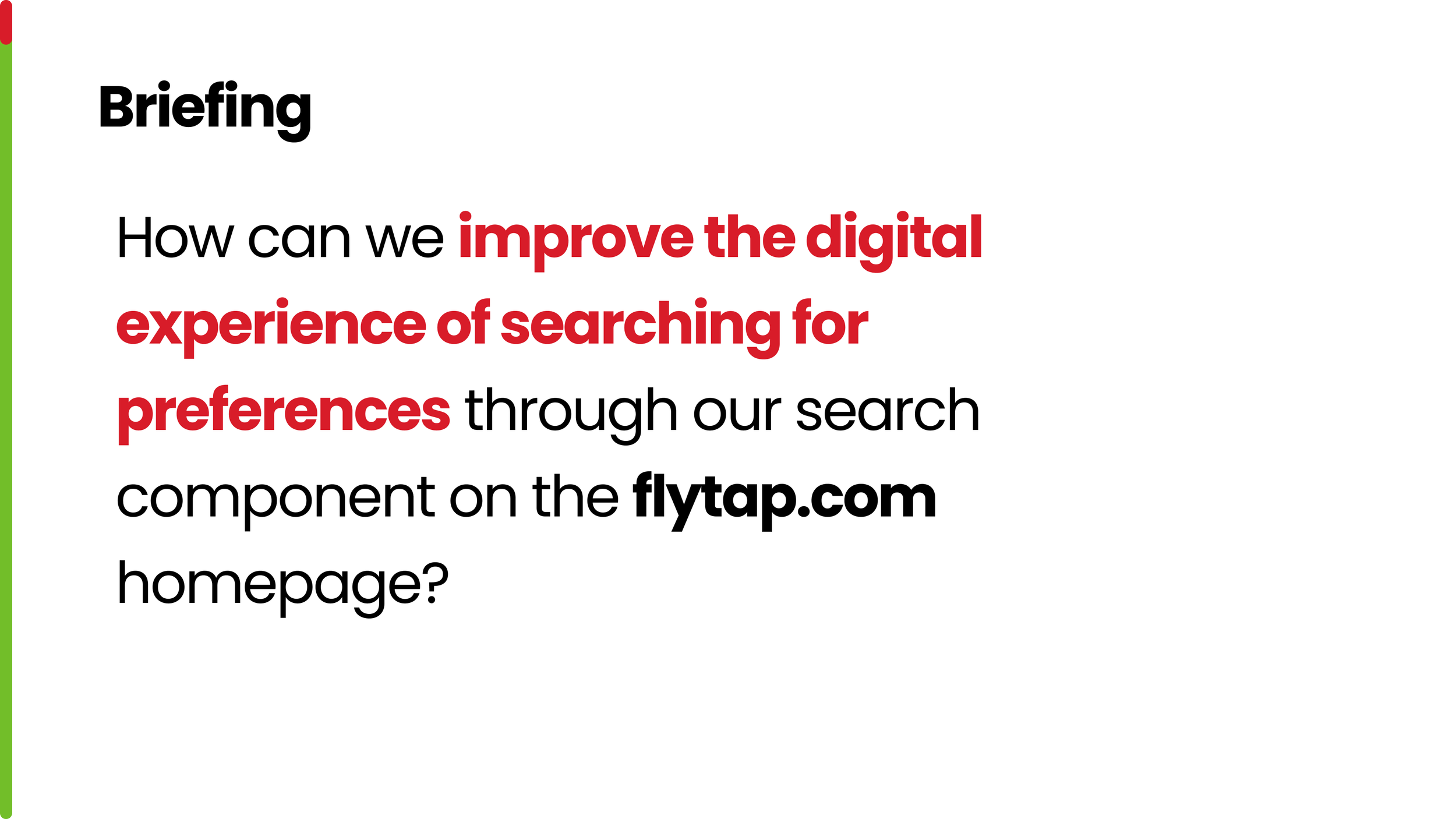
TAP Air Portugal challenged us through the 360º Project at EDIT. to improve the digital experience of its website. The briefing focused on redesigning the search component on the flytap.com homepage, aiming to make it more intuitive, efficient, and aligned with users’ needs.
STARTING PROCESS
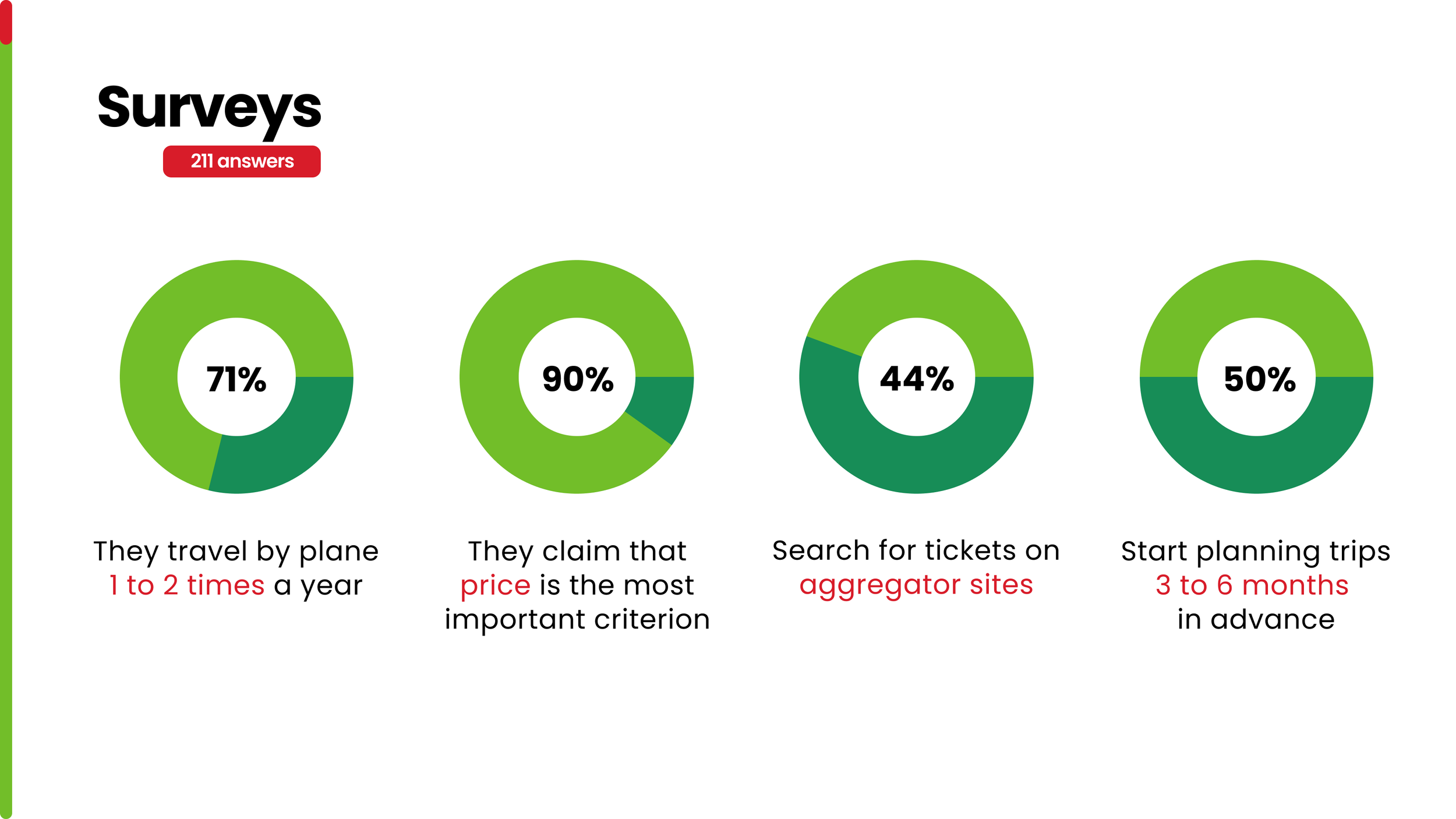
To validate our design decisions, we conducted a survey with 211 respondents, which revealed valuable insights into users’ travel behaviors. Most participants travel by plane 1 to 2 times a year, with 90% stating price as the most important criterion. Additionally, 44% prefer searching for tickets on aggregator sites, and half of them start planning trips 3 to 6 months in advance.
These findings highlighted users’ priorities and directly informed the focus of our design solutions, ensuring alignment with their real needs and expectations.
SURVEY
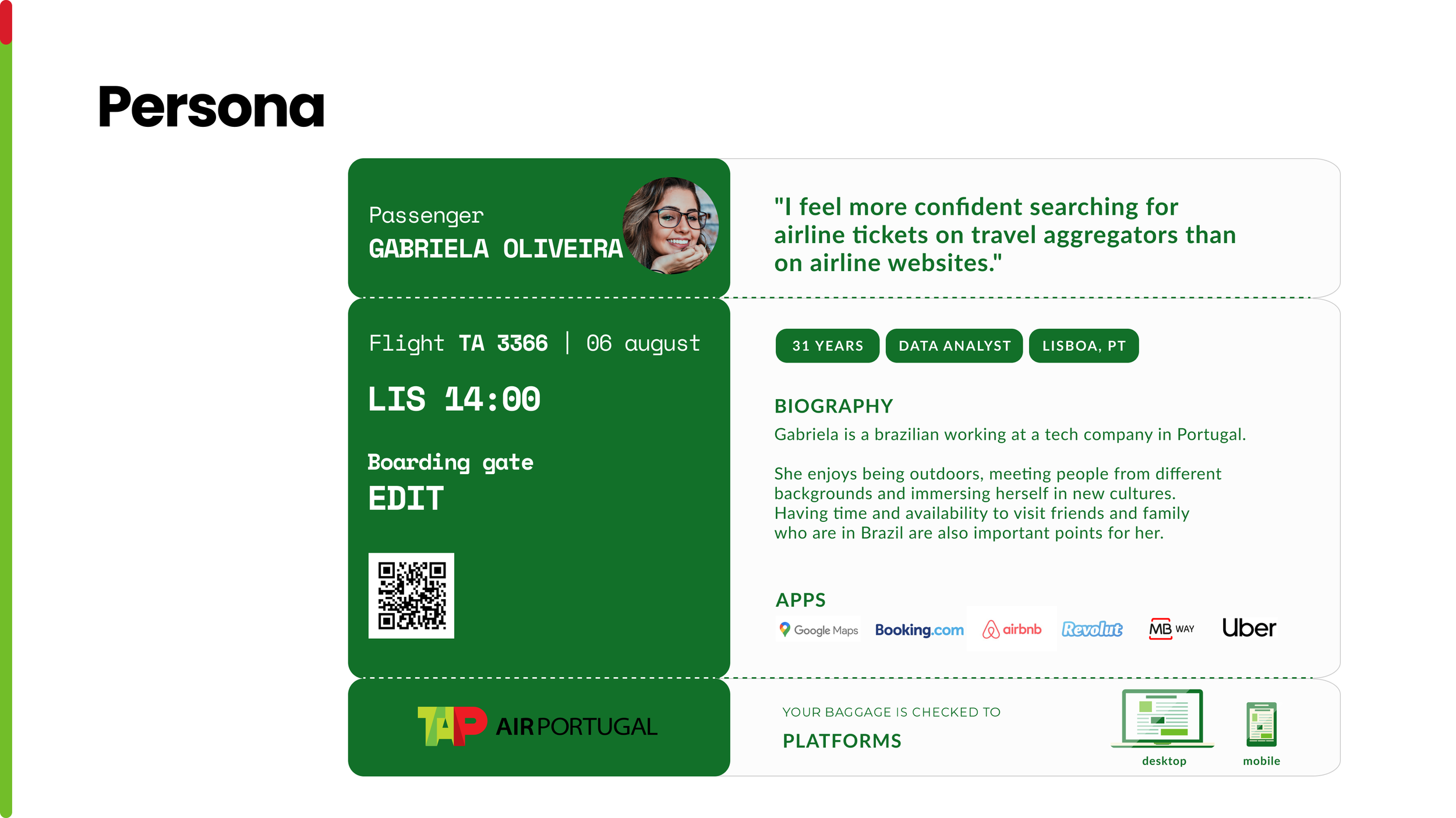
INTERVIEWS & PERSONA
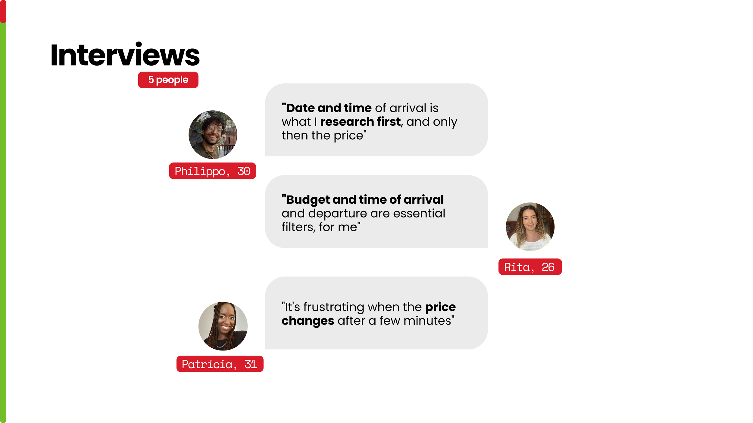
To complement the survey results, we conducted five interviews to gain deeper qualitative insights into users’ frustrations and priorities when booking flights.
Participants highlighted the importance of budget, dates, and time of arrival, while also expressing concerns about price fluctuations and the lack of reliable filters. These perspectives helped us uncover pain points that would guide the design improvements.
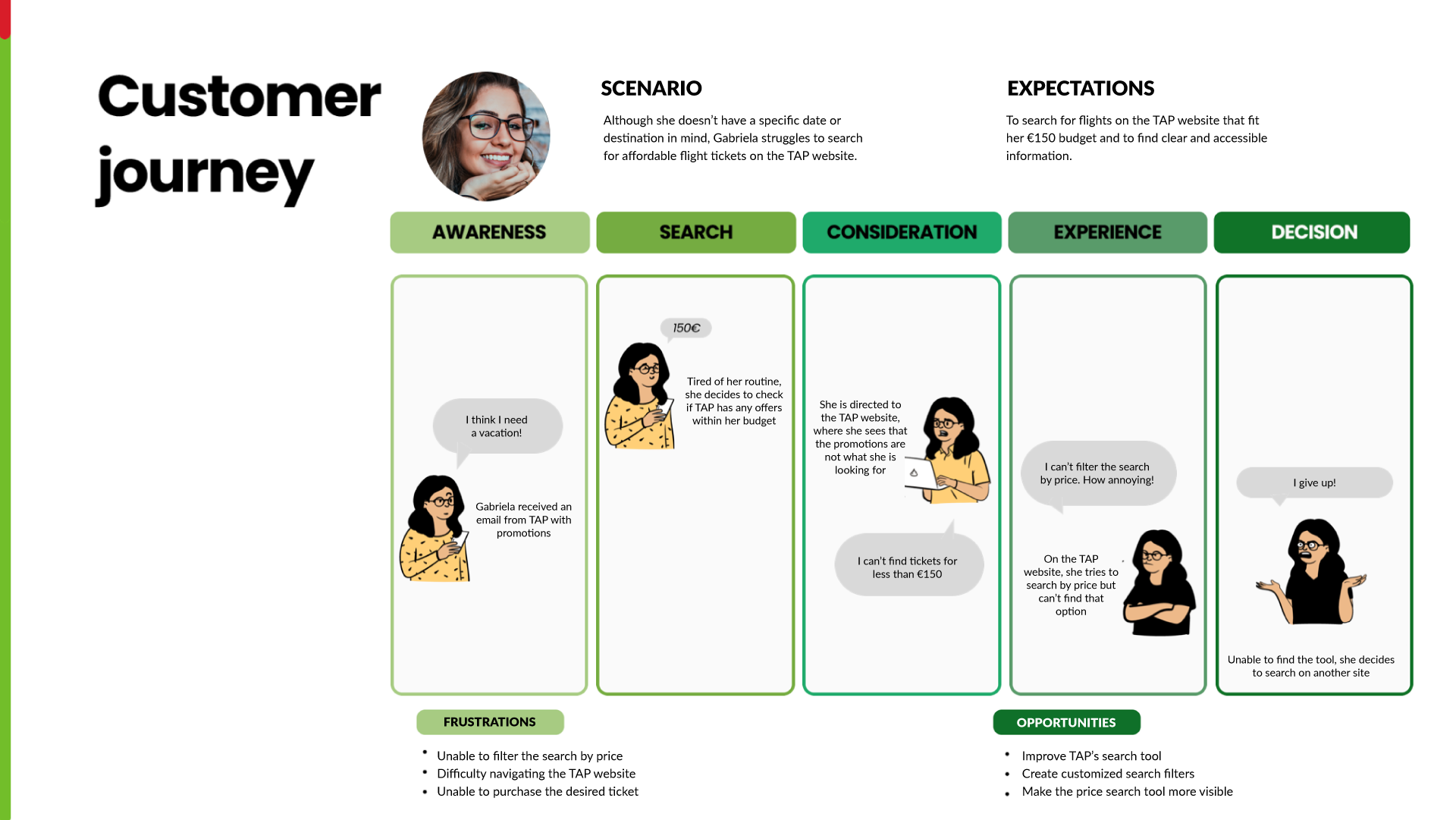
COSTUMER JOURNEY
The customer journey mapped Gabriela’s experience when searching for flights on the TAP website. Despite receiving promotional emails, she faced difficulties finding offers that matched her budget and struggled with the lack of clear price filters.
This process revealed key frustrations such as navigation challenges and the inability to filter by price, but also highlighted opportunities to redesign the search tool, improve visibility of filters, and create a more user-friendly experience.
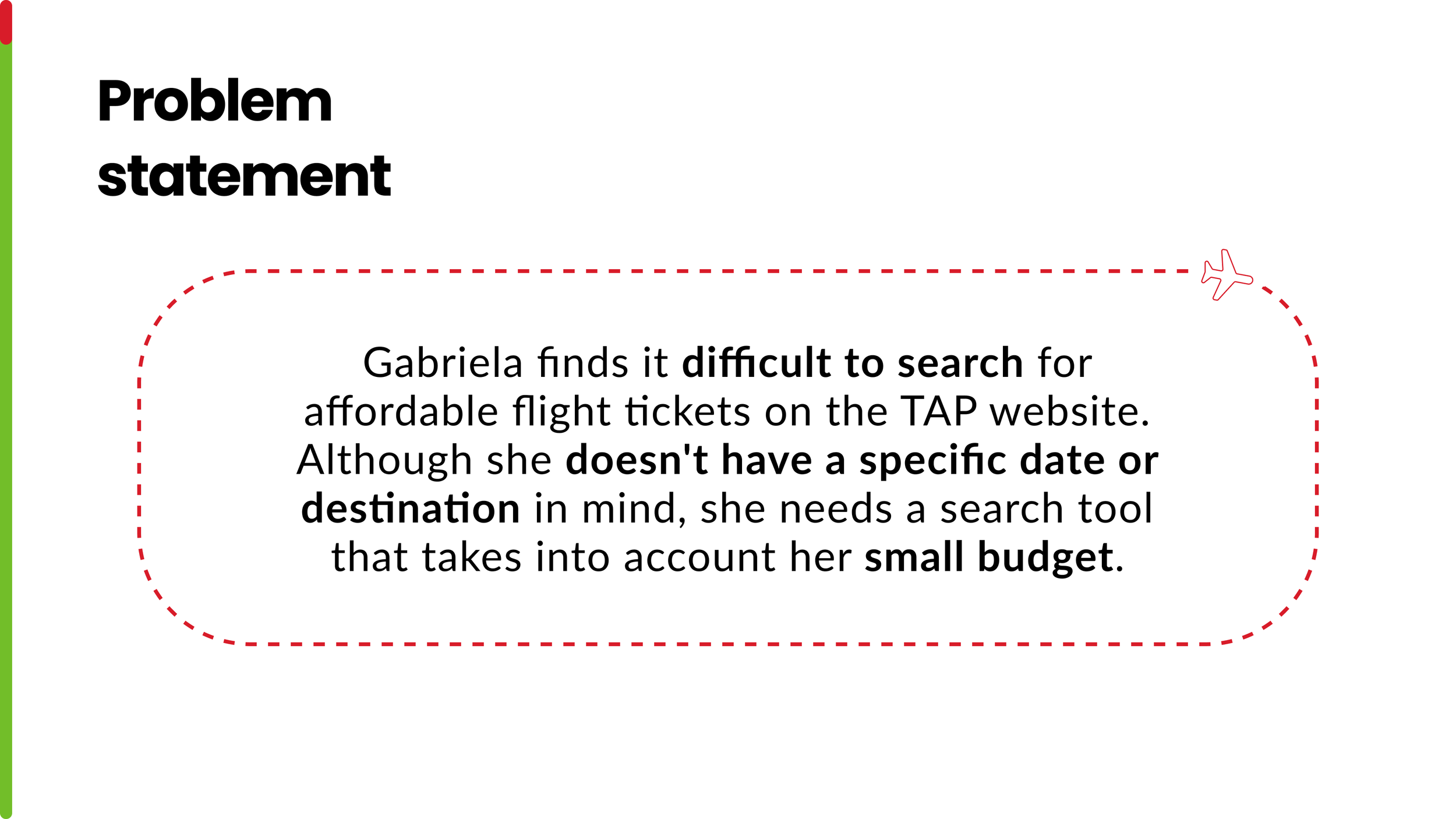
PROBLEM STATEMENT
Our research revealed that many users, like Gabriela, struggle to find affordable flight options on the TAP website when they don’t have a fixed date or destination in mind. This highlighted a gap in the search experience, where budget and flexibility are not fully supported, reinforcing the need for a more intuitive and adaptive search tool.
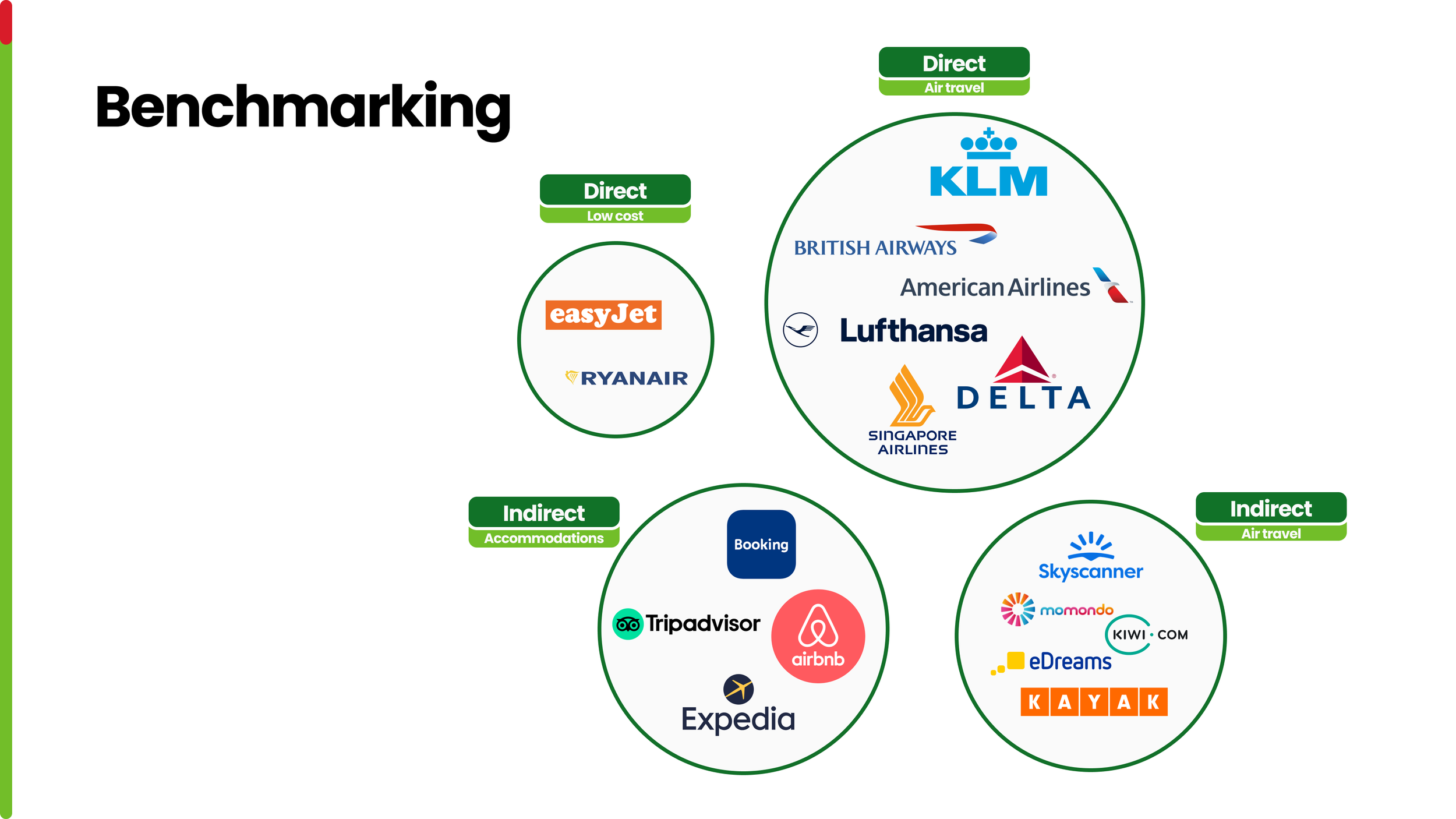
BENCHMARKING (DIRECT & INDIRECT)
To better understand the competitive landscape, we analyzed both direct and indirect competitors. Direct competitors included traditional airlines such as KLM, Lufthansa, and British Airways, as well as low-cost carriers like Ryanair and easyJet. Indirect competitors, such as Skyscanner, Kayak, and Expedia, offered valuable insights into search flexibility and user-friendly filters.
This comparison helped us identify best practices and opportunities to improve TAP’s search experience.
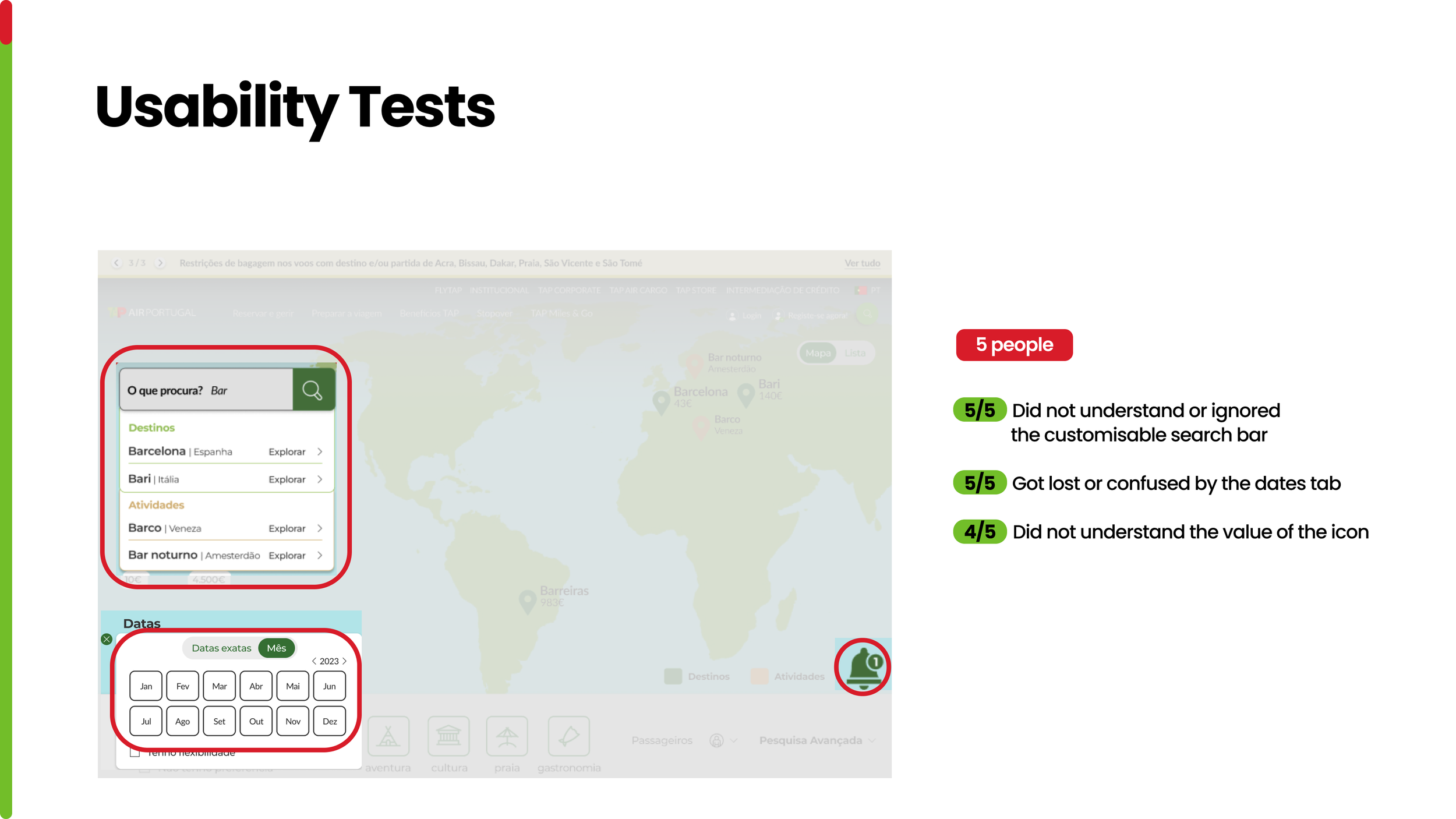
USABILITY TESTS
To validate our prototype, we conducted usability tests with five participants. The results revealed recurring issues: all users struggled to understand or completely ignored the customizable search bar, and all of them got confused when navigating the dates tab. Additionally, most participants (4 out of 5) did not understand the purpose of the icon.
These findings highlighted critical areas for improvement in clarity and usability.
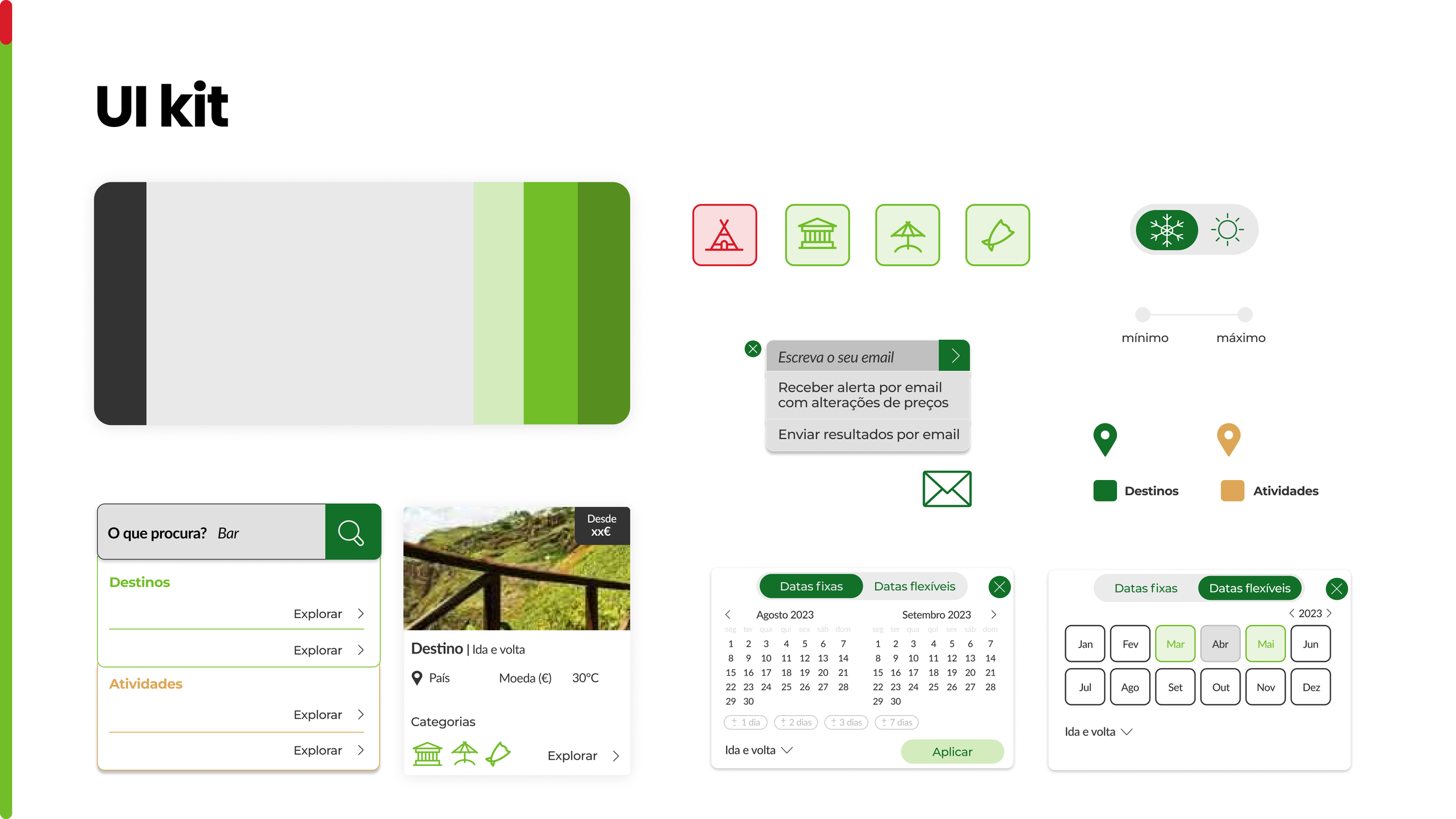
UI KIT
The UI kit was developed to ensure consistency across all components of the redesigned search experience. It included a cohesive color palette inspired by TAP’s brand identity, custom icons, buttons, toggles, and input fields. Each element was designed with usability and accessibility in mind, creating a clear and intuitive visual language to support the prototype.
TEAM
Natália Fazenda
Rafael Almeida
Raquel Brotas
Rute Guerreiro
MENTORS
Francisco Mouga
Hugo Oliveira Vieira
Rui Soares
TAP IN-HOUSE TEAM
Salomé Afonso
Victor Afonso
IMPACT
The project demonstrated the potential of improving TAP’s digital experience by redesigning its search functionality. The final prototype enabled users like Gabriela to search for flights with greater agility and according to their preferences, addressing key frustrations identified during the research phase.
For TAP, the solution not only enhanced the search experience but also created an opportunity to attract new customers and strengthen its positioning as a user-centric airline.