
Yämmi is a kitchen robot that simplifies meal preparation, but its digital presence had not yet kept up with users’ needs. This academic project developed at EDIT. aimed to create a mobile application to complement the product.
CLIENT COMPANY
EDIT. – Disruptive Digital Education
YEAR
2023
EXPERTISE
Heuristic Evaluation
Desk Research
Survey
Competitor Analysis
Benchmarking (Direct & Indirect)
Problem Statement
Wireframes Low-Fi & Hi-Fi
UI Kit
Visual Design
Prototype
UX/UI Case Study
SOFTWARE & PLATFORMS
Figma & Figjam
Adobe Illustrator
Adobe Photoshop
Accessible Brand Colors
Similar Web
RESEARCH METHODS
Heuristic Evaluation
Desk Research
Competition Analysis (Direct & Indirect)
Benchmarking
Survey
Color Accessibility Tests
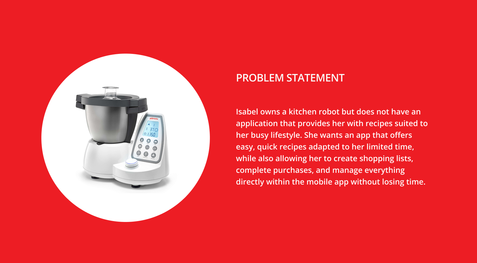
Problem Statement
IDEATION
Wireframes Low-Fi
Wireframes Hi-Fi
UI Kit
Visual Design
Prototype
ROLE
UX/UI Designer
(Group Project - detailed below)
SEGMENT
Cooking Apps

PROJECT OVERVIEW
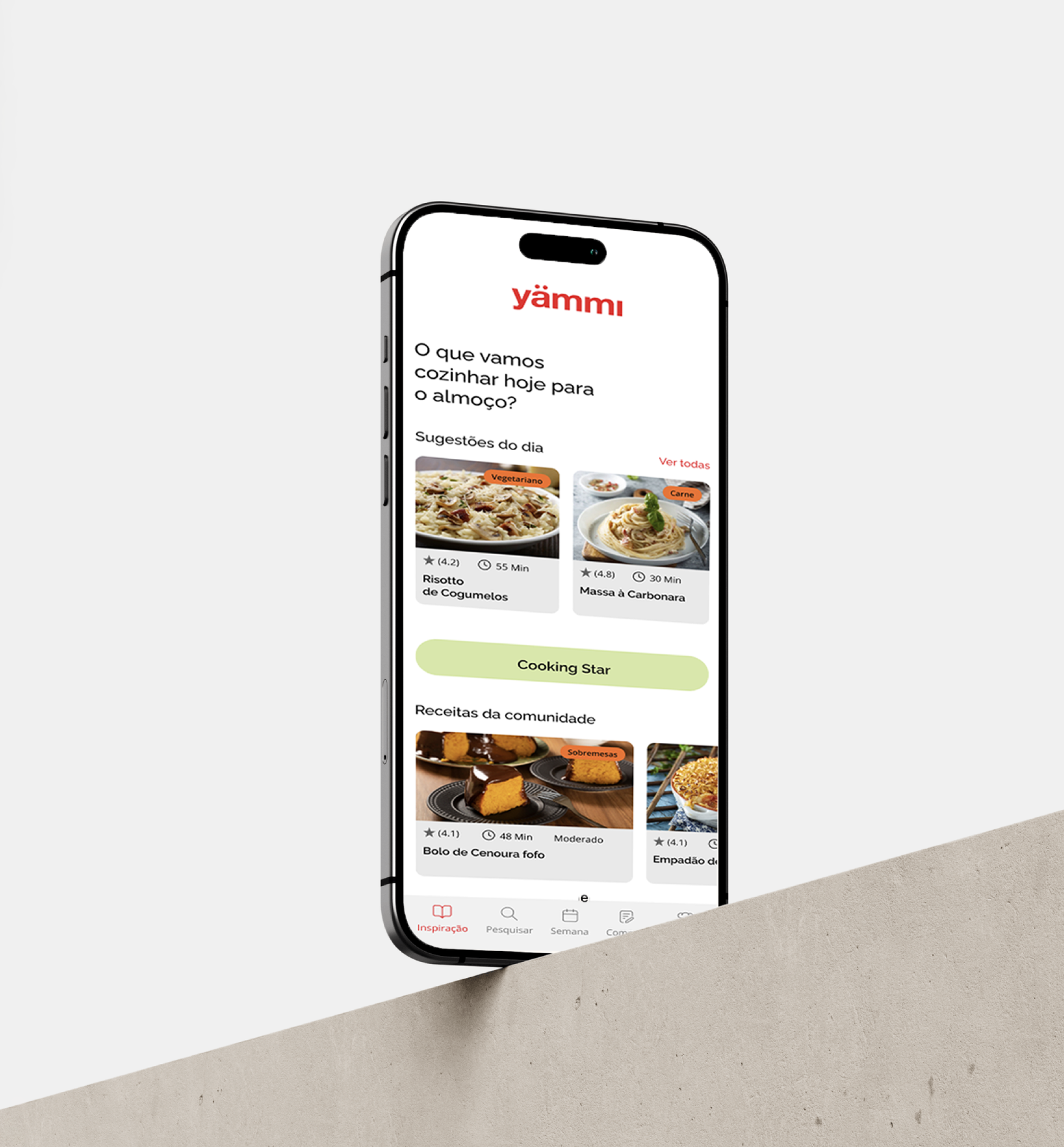
The project focused on designing a mobile app for Yämmi, aiming to extend the cooking robot’s value through digital features. The app was conceived to simplify users’ daily routines by integrating recipe search, pantry management, and a shopping list connected to Continente Online.
CHALLENGE
The main challenge was to define features that matched the real needs of busy users, who seek quick, practical, and affordable home-cooked meals. At the same time, we identified an opportunity to integrate Continente Online directly within the app, creating not only a seamless user experience but also a potential business opportunity for the brand.


STARTING PROCESS
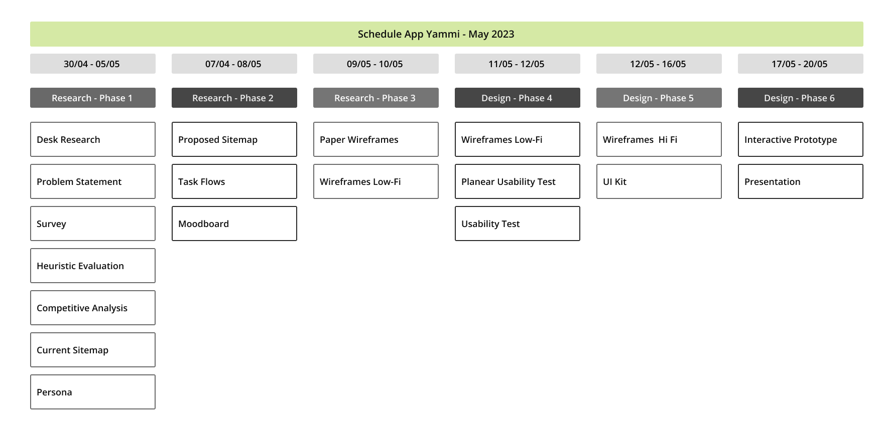
Roadmap & Desk Research
The project started with a roadmap to define each stage of the process, followed by desk research. Using data from SimilarWeb, we analyzed the audience profile of Yämmi’s website, including demographics such as gender distribution and age ranges. In addition, we reviewed online customer comments from retailers like Worten, which provided valuable qualitative insights into user experiences and pain points.
While these findings were important, they were not sufficient on their own, which led us to conduct a survey to gather deeper and more structured data from potential users.

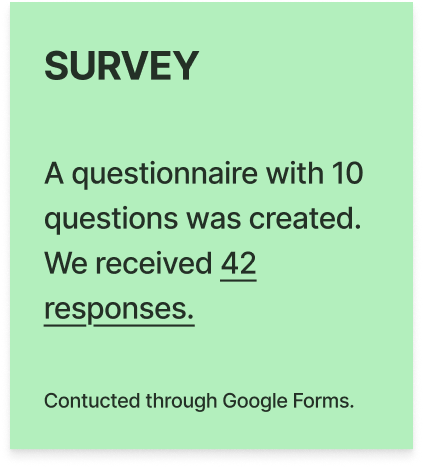
To support the design process, we needed to gather quantitative data that could justify our decisions more solidly when shaping the wireframes and user flows. The survey results provided key insights, such as the fact that the majority of respondents reported using their kitchen robot mainly through a smartphone. This insight directly influenced our decision to prioritize the mobile-first approach in the app design, ensuring the solution was aligned with the users’ real habits and preferences.
SURVEY

HEURISTIC EVALUATION
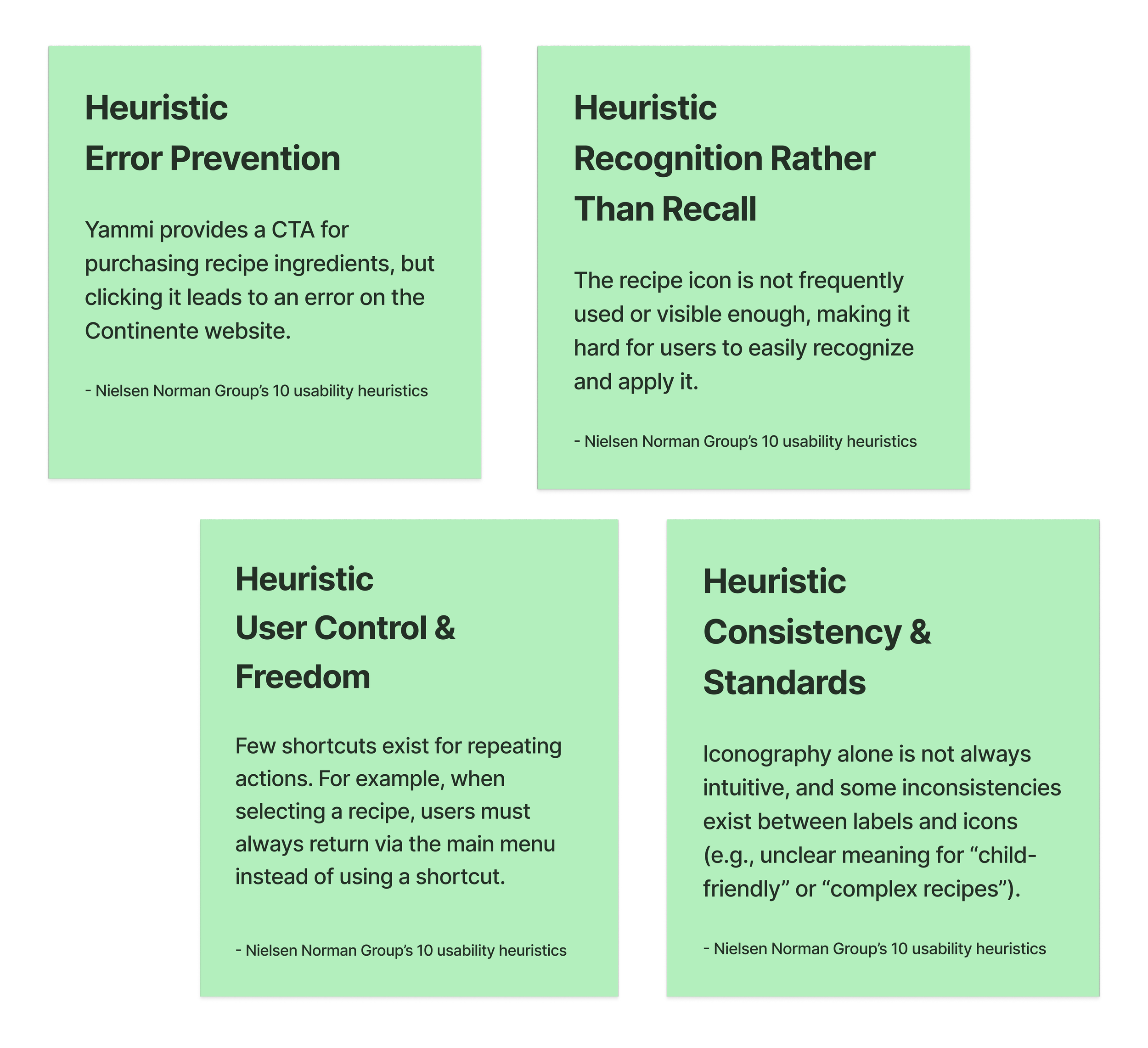
As part of the process, I conducted a heuristic evaluation of Yämmi’s existing website, analyzing it against Nielsen Norman Group’s 10 usability principles. This assessment made it possible to identify usability issues and opportunities for improvement, ranging from navigation shortcuts and icon recognition to consistency in visual standards and error prevention.
These findings provided a clear foundation for defining priorities and guided the next steps in the redesign process.


BENCHMARKING - DIRECT & INDIRECT & COMPETITIVE ANALYSIS
At this stage, I conducted a benchmarking analysis of both direct and indirect competitors. The goal was to identify what other brands were offering, while also uncovering opportunities for Yammi to improve its digital experience.
Through the competitive analysis, it became clear which features were standard in the market and which were missing from Yammi’s current offer. In addition, analyzing indirect competitors, apps specialized in features like shopping list management, helped inspire ideas to enhance specific functionalities and ensure a more comprehensive solution.
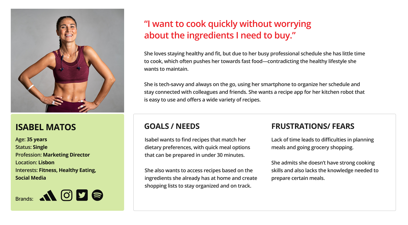
PERSONA & PROBLEM STATEMENT
Based on the data collected from sources such as SimilarWeb and user reviews, we were able to start building an archetype of the person the app was intended for.
By analyzing the apps and brands this user already interacts with, we identified usability patterns and behaviors that she is familiar with. These insights allowed us to define a persona and apply recognizable interaction models, ensuring the new app design would feel intuitive and aligned with her expectations.

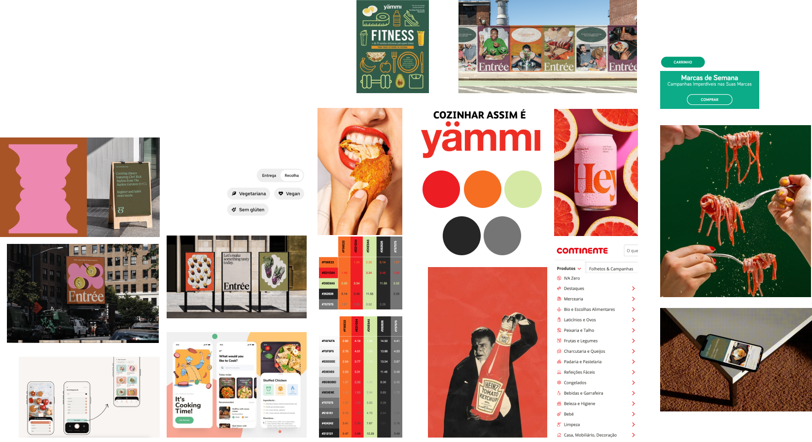
MOODBOARD
For the moodboard, we aimed to preserve the identity colors of Yämmi and Continente while introducing complementary tones that enhanced visual contrast. To validate these choices, the selected palette was tested using Accessible Brand Colors, ensuring proper accessibility compliance and readability across digital platforms.


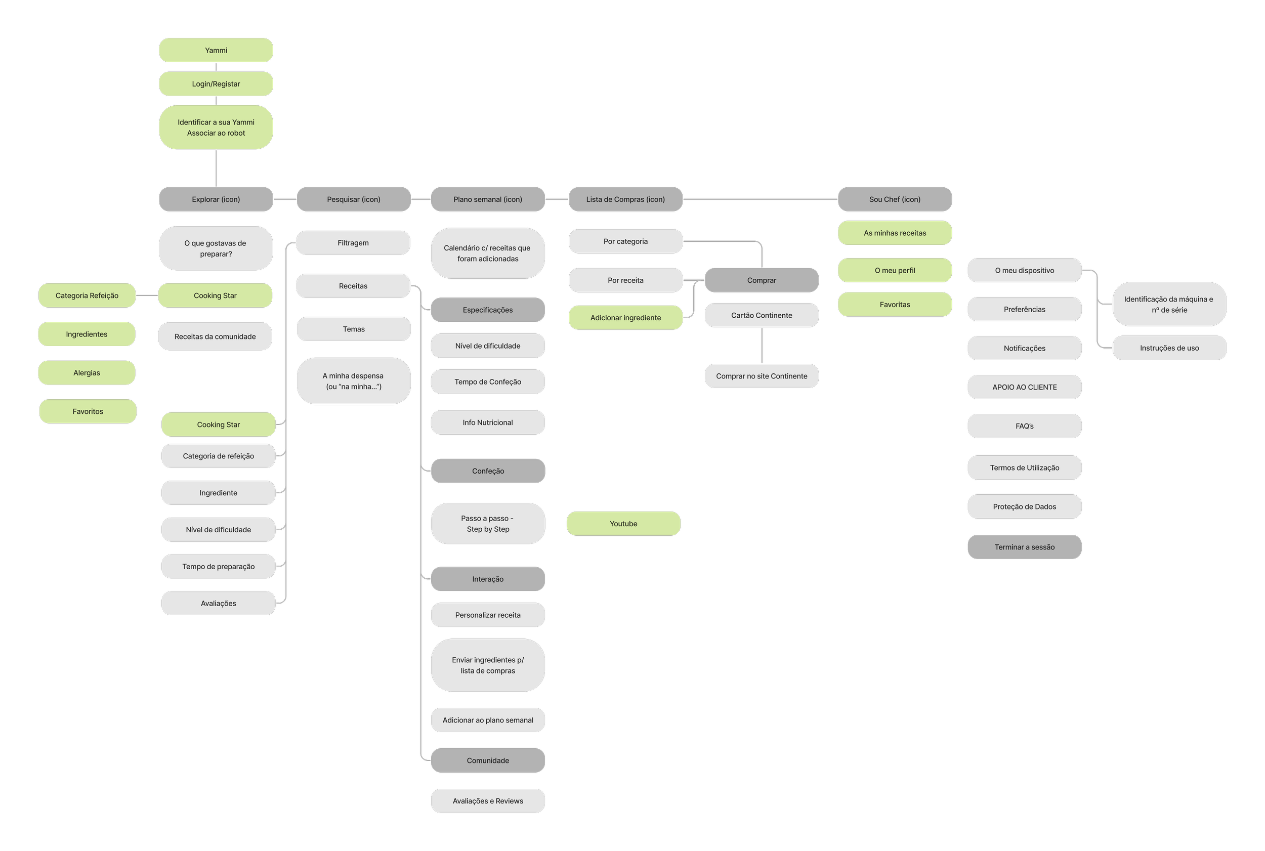
WIREFRAMES LOW-FI & WIREFRAMES HI-FI
The design process started with low-fidelity wireframes, sketched on paper to quickly explore ideas and layout possibilities. This stage allowed us to validate flows and structure without focusing on visual details, ensuring the main functionalities were aligned with user needs.
Once the flows were refined, we moved into high-fidelity wireframes, where the interface was detailed with precise layouts and components. This step brought us closer to the final prototype, combining functionality with the visual identity defined in the design system.
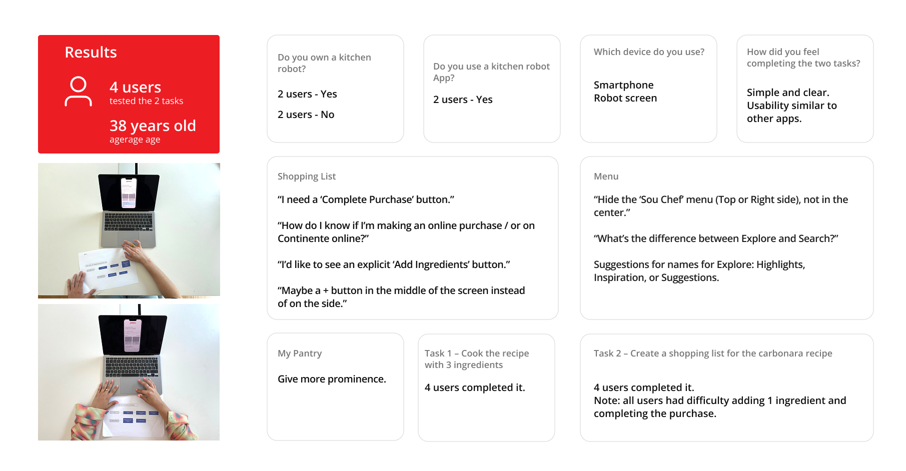
USABILITY TESTS
To validate the proposed solutions, we conducted usability tests with four users, who performed two predefined tasks. The average age of participants was 38 years old, and their profiles varied between current kitchen robot owners and non-owners. The tests helped us identify key improvement opportunities, such as the need for a clearer shopping list flow and better prominence for certain features like “My Pantry.”
Despite small challenges, such as difficulties adding ingredients and completing the purchase flow, all users were able to successfully complete the tasks. The feedback confirmed the overall clarity and usability of the prototype, highlighting that the experience was intuitive and aligned with patterns users already recognized from other apps.
These insights provided a solid foundation to move forward into the UI Kit and Visual Design phases, ensuring that design decisions were directly informed by real user feedback.

UI KIT
The UI Kit was developed to ensure consistency and coherence across the entire interface. It includes the definition of typography, color palette, buttons, icons, and components such as cards and navigation bars.
This system allowed for a cohesive and scalable design, ensuring a smooth transition from wireframes to high-fidelity prototypes.

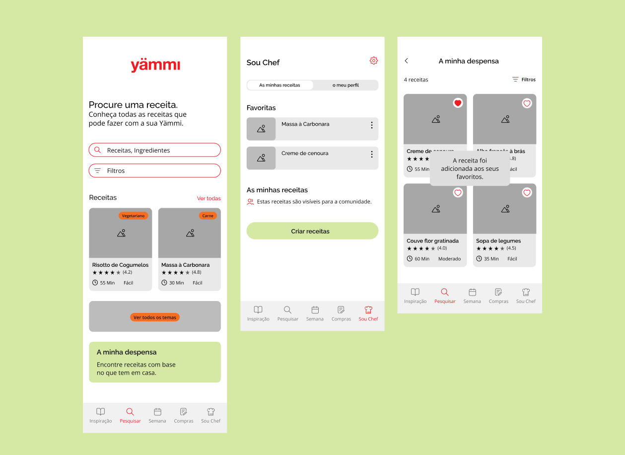
VISUAL DESIGN
The visual design phase focused on translating the research insights into a clean and functional interface. We prioritized clarity and usability by structuring the layouts around intuitive navigation patterns and easily recognizable icons. The use of Yammi and Continente’s brand identity colors, combined with complementary tones, created a balanced contrast that enhanced readability.
TEAM
Carlota Matos
Filipe Correia
Raquel Brotas
Soraia Pereira
MENTORS
Francisco Mouga
Hugo Oliveira Vieira
Rui Soares
IMPACT
The project resulted in the development of a mobile app concept that addressed key user needs, such as accessing quick and healthy recipes, creating shopping lists, and integrating purchases with Continente Online. By combining usability research, competitive analysis, and user testing, the final prototype delivered a solution that was both intuitive and aligned with market opportunities.
This not only provided users with a more seamless cooking and shopping experience but also demonstrated the potential for Yammi to expand its digital ecosystem and strengthen its business strategy.